| Author | Thread |
Comments Made During the Challenge  |
|
|
04/20/2003 01:21:12 PM |
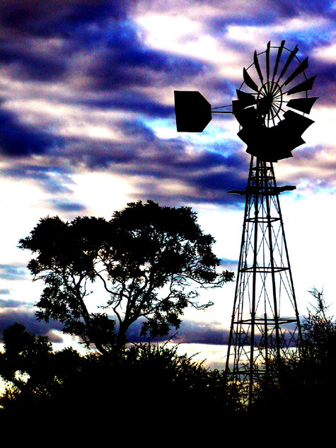
| some areas blown out, sky would have been great, it alread is interesteing. Also blotches of color in this why? Nice compostition with the windmill. |
|
|
|
04/19/2003 03:18:41 PM |
|
|
|
04/19/2003 07:55:29 AM |
| This is an interesting shot. In a digital art category I would score this quite high. I won't score it quite as high in a photography category but I do think it has some artistic merit that isn't normally associated with normal photography. |
|
|
|
04/18/2003 05:06:55 PM |
| Too much post processing takes away from a greatly composed picture. |
|
|
|
04/18/2003 01:27:06 PM |
| Interesting shot. A little too much contrast for my taste, but otherwise nicely done. |
|
|
|
04/17/2003 05:59:27 PM |
| the sky looks too overprocessed to be natural, but I do like the silhouettes you captured! |
|
|
|
04/17/2003 01:52:41 PM |
| I really love the colors for this one. Nice use of grain and color. |
|
|
|
04/17/2003 01:44:40 PM |
| seems too dark and the saturation and hue seems to have been pushed a little too much, nice composition though. |
|
|
|
04/17/2003 01:44:12 PM |
|
|
|
04/15/2003 11:11:49 PM |
| Nice job! The idea of a windmill is really good! How could you get such colors? |
|
|
|
04/15/2003 09:36:12 PM |
| This has a real spooky feeling to it. Seems like it should advertise some sort of horror movie. I'm not a real fan of color distortion, but this gives it emotion with the backlit windmill and tree. There is a lot of artifact, though, that distracts some. |
|
|
|
04/15/2003 09:05:03 PM |
| nice sharp image, good work |
|
|
|
04/15/2003 02:19:10 PM |
| Interesting choice of colour and grain. Nice sharp silowetsilhouette. |
|
|
|
04/15/2003 07:48:30 AM |
| you've tweaked the clouds a bit too much for my taste. |
|
|
|
04/15/2003 07:37:20 AM |
| Whoa - talk about strong. Nice work but I think you pushed the colours a little too much. Nice framing though. 8 - floyd |
|
|
|
04/15/2003 01:34:53 AM |
| Wow the sky is terrible. What happened? |
|
|
|
04/14/2003 05:42:51 PM |
| I really like the composition of this, and the silhouetted shapes, but the sky does absolutely nothing for me. Shame, a more natural sky would have scored much better. |
|
|
|
04/14/2003 05:24:38 PM |
| Great shot... Dark here works well! |
|
|
|
04/14/2003 03:43:31 PM |
| A little over the top with the photoshop filters, spoilt it a bit but well composed.6 |
|
|
|
04/14/2003 01:32:13 PM |
| Well done composition, but IMHO you overdid the postprocessing... |
|
|
|
04/14/2003 09:35:38 AM |
| I love it! There is some graininess in it but for me it works - 10. |
|
|
|
04/14/2003 02:49:43 AM |
| The backlighting is nice but the colors seem oversaturated. |
|
|
|
04/14/2003 01:00:55 AM |
| Besides the noise this is a winner in my eyes!! Nice clours in the sky, and the composition.. |
|
|
|
04/14/2003 12:39:23 AM |
|
|
|
04/14/2003 12:17:13 AM |
| I like the silhouettes and the composition, but the sky seems a little unnatural and overly processed causing it to distract some from the scene. |
|
Home -
Challenges -
Community -
League -
Photos -
Cameras -
Lenses -
Learn -
Help -
Terms of Use -
Privacy -
Top ^
DPChallenge, and website content and design, Copyright © 2001-2025 Challenging Technologies, LLC.
All digital photo copyrights belong to the photographers and may not be used without permission.
Current Server Time: 03/12/2025 02:33:02 PM EDT.