| Author | Thread |
Comments Made During the Challenge  |
|
|
05/28/2005 10:12:40 PM |
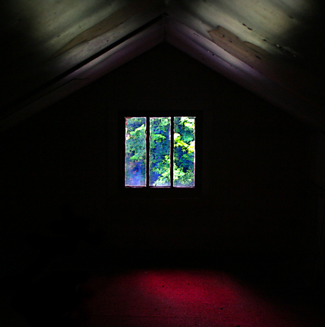
| I like this image, even with the oversaturation (?) It's unusual. Would have liked to have seen more detail in the ceiling |
|
 Photographer found comment helpful. Photographer found comment helpful. |
|
|
05/27/2005 07:52:06 AM |
| the old glass adds antiquity to the photo, nice color from the ceiling, they seem to go with the outside. I think the red on the floor seems to add a feeling from the "niceness" of the other colors. Light upward uniform, the floor goes top right to bottom left, kind of distracting, to me. |
|
| Photographer found comment helpful. |
|
|
05/26/2005 12:13:58 PM |
| there is not enough detail in the room. |
|
| Photographer found comment helpful. |
|
|
05/26/2005 11:38:03 AM |
| interesting post for theme, a bit dark, nice color, dof really not there, comp nice,b&w's good, nice texture |
|
| Photographer found comment helpful. |
|
|
05/25/2005 10:02:24 AM |
| Hmm was my first reaction. The more I look at this the more I like it. I like the blackness and the roof light and the painted effect through the window but I wondered where the red light is coming from, presumably its red carpet? I think if that had been a wooden floor it would have completed it. Good luck |
|
| Photographer found comment helpful. |
|
|
05/24/2005 02:38:51 PM |
| great contrast of lighting, colors, and mood within the photograph. I would probably suggest putting the window off-center |
|
| Photographer found comment helpful. |
Home -
Challenges -
Community -
League -
Photos -
Cameras -
Lenses -
Learn -
Help -
Terms of Use -
Privacy -
Top ^
DPChallenge, and website content and design, Copyright © 2001-2025 Challenging Technologies, LLC.
All digital photo copyrights belong to the photographers and may not be used without permission.
Current Server Time: 03/12/2025 12:44:13 PM EDT.