| Author | Thread |
|
|
06/08/2005 04:16:51 PM |
|
Comments Made During the Challenge  |
|
|
06/06/2005 02:37:22 PM |
| I don't understand this photo |
|
|
|
06/06/2005 07:04:53 AM |
| Not enough image to really vote on. |
|
|
|
06/06/2005 01:04:35 AM |
|
|
|
06/05/2005 01:04:15 PM |
| Sorry if i'm being an idiot but i fail to see what effect you were trying for here or how it relates to the challenge! |
|
|
|
06/03/2005 02:59:45 AM |
| Maybe my screen isn't bright enough, but it's hard to make out what's in the photo. |
|
|
|
06/02/2005 05:25:56 PM |
| The black was done nicely. The subject is good. I don't get the choices. Could crop more. |
|
|
|
06/02/2005 01:27:21 AM |
| I don't feel that the image conveys instantly recognizable decision. Too dark, and I don't see the subject all that well. |
|
|
|
06/01/2005 10:57:28 PM |
| I rated this low because I could not figure out the subject. I like the deep black framing of the subject though. |
|
|
|
06/01/2005 06:45:52 PM |
|
 Photographer found comment helpful. Photographer found comment helpful. |
|
|
06/01/2005 06:13:43 PM |
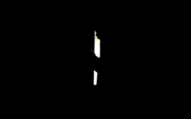
| Almost an exact opposite decision here as the white image that was also submitted in the challenge. Good to see a bit more variety in the message, however the stark contrast of light and dark leads this viewer to wonder if the white is really nothing more than a blown out highlight. As I continue to evaluate the image, however I am struck with the thought that this could be a person in a darkened house, opening a door to look outside. The concept becomes very powerful in the realm of fear. 'Should I venture beyond?' This raises the bar on the message of the image, however the concept's execution seems to have fallen prey to too little detail and too much darkness. I want desperately to give higher marks for this, but am held back from not being able to see some detail of the life that is hiding in the blackness. If more detail either in the open doorway or the interior were visible I could find myself knocking this image up anywhere for 2 to 4 points. For now I bump this to a 4, simply on the anticipation that slowly came over me as I continued to evaluate. I may return again. |
|
| Photographer found comment helpful. |
|
|
06/01/2005 04:51:32 PM |
| his mind is empty? heh. This could have worked out a lot better, had we been able to see it. Sorry. Good try! i like the idea |
|
|
|
06/01/2005 03:41:29 PM |
| the composition is lacking, somewhat. i like the face part of the sillhouette, but there's not enough to hold onto in this one. plus, the subject's being centered on the photograph reduces the dramatic quality. if he were on the right, you might wonder more what he's looking into.. if he were on the left, you might wonder what he's leaving behind. but in the center... its just.. not speaking to me. |
|
|
|
06/01/2005 09:10:46 AM |
|
|
|
06/01/2005 08:30:48 AM |
I am not considering titles in this challenge looking for images that meet the challenge description visually.....
Meets challenge description...........1 (sorry I don't understand this image)
Technical.............................4
Artistic.................1
Average...........2 I am sorry but this image really didn't spark anything in me...Perhaps because I did not understand what you were trying to say..... |
|
|
|
06/01/2005 02:23:13 AM |
|
|
|
06/01/2005 01:27:18 AM |
|
Home -
Challenges -
Community -
League -
Photos -
Cameras -
Lenses -
Learn -
Help -
Terms of Use -
Privacy -
Top ^
DPChallenge, and website content and design, Copyright © 2001-2025 Challenging Technologies, LLC.
All digital photo copyrights belong to the photographers and may not be used without permission.
Current Server Time: 03/12/2025 08:03:41 PM EDT.