| Author | Thread |
|
|
10/01/2006 03:18:36 PM |
Message edited by author 2008-03-31 20:34:12. |
|
Comments Made During the Challenge  |
|
|
06/05/2005 09:30:43 PM |
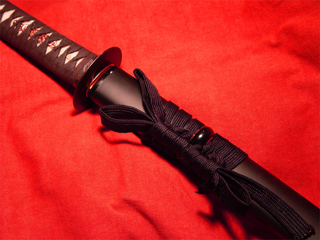
| Nice simple image but the handle seems to be out of focus. |
|
 Photographer found comment helpful. Photographer found comment helpful. |
|
|
06/03/2005 06:44:11 PM |
| if this is a real sword, I'd really like to by it :) |
|
|
|
06/03/2005 06:36:03 PM |
| The red background seems a bit oversaturated in my opinion. |
|
| Photographer found comment helpful. |
|
|
06/03/2005 04:10:10 PM |
| Iaito is a beautiful and sublte art. I wish this photo reflected that better. Light from more than one direction, and at interesting angles would better bring out the details in the sword. A lower camera angle might create a composition that would fill the frame with the sword and not have so much bland reb background in the shot. |
|
| Photographer found comment helpful. |
|
|
06/02/2005 08:46:42 PM |
| I think its beautiful in its own way, good luck. |
|
|
|
06/01/2005 06:32:49 PM |
| I gave this a 6. I'm a big fan of swords in general, and this is a lovely example, but I might have considered sliding the sheath out about 3 inches. I think this would have given it a bit more pop, The shadows are also a slight bit harsh, elevating it 3-4 inches and decreasing the DOF as much as possible might have helped that, as well as caused the detail in the background to show less, while still keeping the braiding on the grip and cording. |
|
| Photographer found comment helpful. |
|
|
05/31/2005 03:58:29 PM |
Beauty is a subjective thing, I know. In my scoring and comments I'm trying to score based on NOT whether or not I would think a particular subject beautiful, but on whether the photographer has succeeded in creating a beautiful photo. I look for the elements of color, lines, focus and dof interest, lighting, and a certain element of grace and lovlieness. I'm looking for a unique and creative appeal for the highest scorers.
That being said, this strikes me as more of a product photo, like what you might take to sell it on Ebay. Just a fairly straight forward shot with enough lighting to see the details. The red is a bit overwhelming and I think it detracts from your subject. It's not a bad shot, really. (I honestly don't even know what this is....looks like some sort of sword or something?) The angle, colors, and lines just don't convey beauty to me.
|
|
| Photographer found comment helpful. |
|
|
05/30/2005 02:13:38 PM |
| I like the red background. However, the few wrinkles (not really wrinkles, but not smooth places) are a bit distracting. Perhaps either pulling the whole thing smooth (if possible) or deliberately adding them to give it a rumpled look. |
|
| Photographer found comment helpful. |
Home -
Challenges -
Community -
League -
Photos -
Cameras -
Lenses -
Learn -
Help -
Terms of Use -
Privacy -
Top ^
DPChallenge, and website content and design, Copyright © 2001-2025 Challenging Technologies, LLC.
All digital photo copyrights belong to the photographers and may not be used without permission.
Current Server Time: 03/16/2025 10:06:25 AM EDT.