| Author | Thread |
|
|
06/15/2005 02:50:40 AM |
| Thankyou all very much for the comments. |
|
Comments Made During the Challenge  |
|
|
06/14/2005 10:29:49 PM |
| Not quite yet, but getting there. Bumping up. |
|
|
|
06/14/2005 09:58:29 AM |
| makes you want to stare at it. Which is what most photographers want. |
|
|
|
06/13/2005 08:45:51 AM |
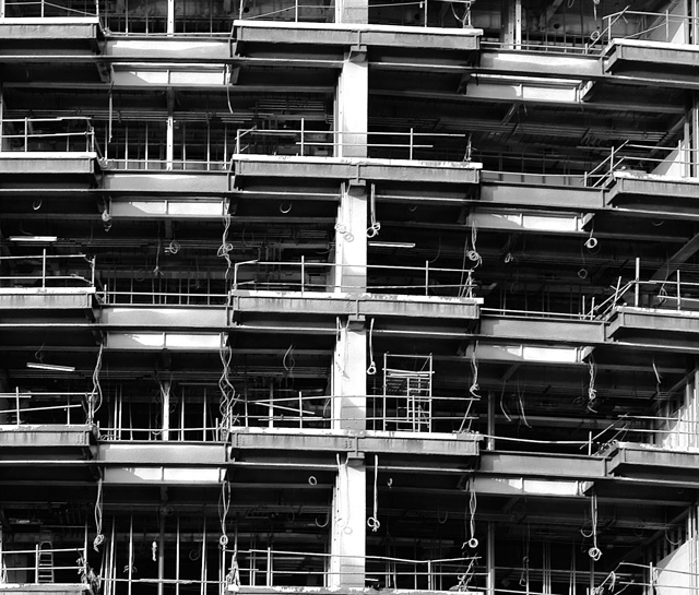
| very nice picture. You managed to capture the depressing fealing of living in a "box of matches"..the big cities are like his. |
|
 Photographer found comment helpful. Photographer found comment helpful. |
|
|
06/11/2005 08:49:06 PM |
| You've found a great repeating pattern here however it's listing to the right. Straightening the 'horizon' so to speak would make this much better. (IMO) |
|
| Photographer found comment helpful. |
|
|
06/10/2005 07:03:24 PM |
| Nice Composition, Cleverly Done. |
|
| Photographer found comment helpful. |
|
|
06/10/2005 05:05:33 PM |
| jagged symmetry. good shadows, lines, depth. b/w right choice. |
|
| Photographer found comment helpful. |
|
|
06/09/2005 01:04:38 PM |
| Lovely composition. It has good resoluton and color, and just plain "looks good", which is the point , right! |
|
| Photographer found comment helpful. |
|
|
06/09/2005 12:55:15 PM |
| Nice, but the distortion in the lens is kind of ruining this shot for me personally, not of course unless the building itself is all slanty like that but other than that I really like this shot, great composition and the tonal range is very good. |
|
| Photographer found comment helpful. |
|
|
06/09/2005 12:49:50 PM |
| Could you have gotten the photo to crop to get at the boundary of each cell? Or split a cell in half on the border? |
|
| Photographer found comment helpful. |
|
|
06/09/2005 05:44:17 AM |
| Great pattern on this picture, good work. |
|
| Photographer found comment helpful. |
|
|
06/09/2005 01:46:00 AM |
| Nice capture. I like the lines and shapes present in your composition. |
|
| Photographer found comment helpful. |
|
|
06/08/2005 09:01:24 PM |
ha ha ha ha ha ha ha ha ha ha ha
8
i like it so much |
|
| Photographer found comment helpful. |
|
|
06/08/2005 05:02:47 AM |
For me this has the potential to be a nice picture but there are a couple of elements that throw off the balance. First off, the horizontal lines are slanted to the right, the main vertical line is skewed and also too much in the center ( it's very imposing) and finally there is no start or end, a tighter top/bottom crop would help this picture... But that just my opinion! What I do like is use of black and white and shadow.
Cheers,
Eric R Thibodeau |
|
| Photographer found comment helpful. |
Home -
Challenges -
Community -
League -
Photos -
Cameras -
Lenses -
Learn -
Help -
Terms of Use -
Privacy -
Top ^
DPChallenge, and website content and design, Copyright © 2001-2025 Challenging Technologies, LLC.
All digital photo copyrights belong to the photographers and may not be used without permission.
Current Server Time: 04/26/2025 07:21:52 PM EDT.