| Author | Thread |
Comments Made During the Challenge  |
|
|
06/14/2005 11:14:38 PM |
| I don't think the wall in the foreground adds anything. The composition it a little uninteresting, sorry. Maybe taken at a different angle? |
|
|
|
06/14/2005 08:20:40 PM |
| Overall, this is a very nice shot. A closer crop (the blurry stone wall in front in front is distracting) would have improved the image, though. |
|
|
|
06/14/2005 06:43:15 PM |
| The wall at the bottom is a bit distracting. |
|
 Photographer found comment helpful. Photographer found comment helpful. |
|
|
06/14/2005 11:01:43 AM |
| The stone wall helps some, but I'm still a little bored by the composition of this shot. |
|
| Photographer found comment helpful. |
|
|
06/14/2005 09:55:16 AM |
| fits challenge great, but just lacks something |
|
| Photographer found comment helpful. |
|
|
06/12/2005 06:28:26 PM |
| The stone wall in the forground "Kills" the image. |
|
| Photographer found comment helpful. |
|
|
06/09/2005 01:32:21 PM |
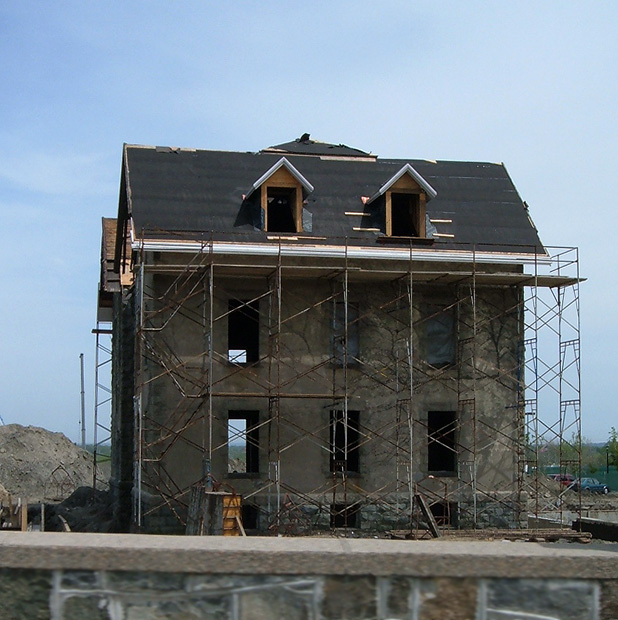
| I would have liked a little more light on the front of the building. |
|
| Photographer found comment helpful. |
|
|
06/09/2005 06:15:03 AM |
| you probably could've made this shot more interesting: could you get a different angle? At least stand on something to get the wall out of the way. |
|
| Photographer found comment helpful. |
|
|
06/09/2005 03:05:46 AM |
| The wall at the bottom seems distracting..try straigtning out the picture a little to the left and crop the wall.. |
|
| Photographer found comment helpful. |
|
|
06/09/2005 02:04:42 AM |
| This is a fitting subject and a good idea. The framing is putting me off just a little though. There seems to be an obvious 'tilt' present in the photo. It's hard to tell if the horizon in the distant background is actually level, but the structure itself, and especially the ledge in the foreground are tilted. This could be corrected with arbitrary rotation in ps. I'm also thinking that maybe if the ledge were actually cropped out, or maybe at least to the ledge itself, removing the 'rock wall' portion in the bottom of the frame it could make the shot stronger, as to me, it seems to just be a distraction to your main subject. |
|
| Photographer found comment helpful. |
|
|
06/08/2005 07:05:41 PM |
| Neat house. I wish you could have either cropped out the ledge on the bottom of the picture, or moved closer to the house. |
|
| Photographer found comment helpful. |
|
|
06/08/2005 06:58:23 PM |
| Great Composition, Good Color and Focus... |
|
| Photographer found comment helpful. |
|
|
06/08/2005 03:44:27 PM |
| I like this. Perhaps better without the wall. |
|
| Photographer found comment helpful. |
Home -
Challenges -
Community -
League -
Photos -
Cameras -
Lenses -
Learn -
Help -
Terms of Use -
Privacy -
Top ^
DPChallenge, and website content and design, Copyright © 2001-2025 Challenging Technologies, LLC.
All digital photo copyrights belong to the photographers and may not be used without permission.
Current Server Time: 04/26/2025 07:30:16 PM EDT.