| Author | Thread |
Comments Made During the Challenge  |
|
|
06/14/2005 07:35:06 PM |
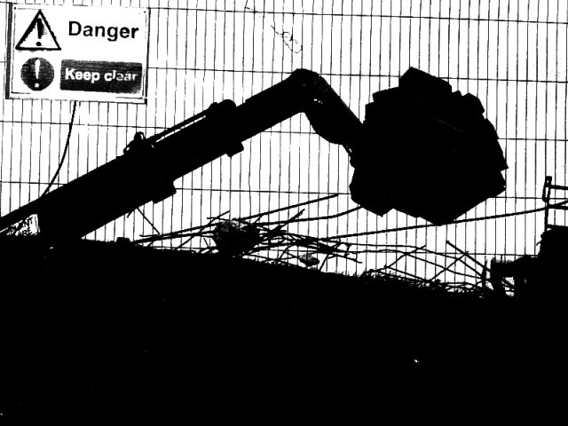
| Nice silhouettes. I would like this more if it were rotated to straighten the horizontals in the fence. Unfortunately, I find the sign distracting - perhaps a slightly larger to reduce it? |
|
 Photographer found comment helpful. Photographer found comment helpful. |
|
|
06/11/2005 04:21:09 PM |
| Very well done in such a minimal way! One of my top ten images of the week. |
|
| Photographer found comment helpful. |
|
|
06/10/2005 07:43:45 PM |
| Nice Composition, Cleverly Done. |
|
| Photographer found comment helpful. |
|
|
06/09/2005 11:37:23 PM |
| This has a nice graphic quality. I like it. |
|
| Photographer found comment helpful. |
|
|
06/09/2005 05:16:39 PM |
| great work. looks like a pencil or pen and ink sketch. |
|
| Photographer found comment helpful. |
|
|
06/09/2005 01:38:27 PM |
| Nice. The high contrast editing gives this a very artistic etched look. |
|
| Photographer found comment helpful. |
|
|
06/09/2005 08:16:50 AM |
| Interesting shot, with dramatic contrast. Maybe cropping out part of the lower black band might have improved it. |
|
| Photographer found comment helpful. |
|
|
06/08/2005 11:51:40 PM |
Interesting. Different from all the others :)
|
|
| Photographer found comment helpful. |
|
|
06/08/2005 12:14:42 AM |
| the sillouette is soooo strong it almost looks like a drawing and not a photo |
|
| Photographer found comment helpful. |
Home -
Challenges -
Community -
League -
Photos -
Cameras -
Lenses -
Learn -
Help -
Terms of Use -
Privacy -
Top ^
DPChallenge, and website content and design, Copyright © 2001-2025 Challenging Technologies, LLC.
All digital photo copyrights belong to the photographers and may not be used without permission.
Current Server Time: 03/13/2025 04:15:45 PM EDT.