| Author | Thread |
|
|
05/02/2003 10:44:31 AM |
Critique Club
Initial thoughts
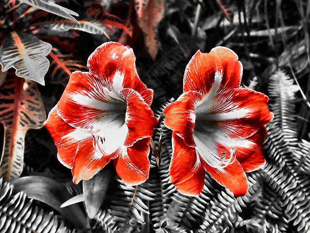
Vivid, striking, interesting reduced colour palette.
Composition/ Content
Great symmetry though overall image seems just a little unbalanced to me � perhaps that there is more space to the left than to the right or the heavier presence of red in the leaves at the top left.
I like the desaturated background and heavily saturated blossoms idea � looks quite unusual to have no greens here.
Background
I think it�s a shame that the top left area of the background has reds left in it whereas the bottom right is completely b/w. That adds to the unbalance for me.
Camera Work - Technical
Looks fine/
Digital Processing - Technical
Seems too sharp to me, but that may just be me.
Fits The Challenge
Yes!
My Opinion On The Photo
Striking and attractive. Composition isn�t one of my favourites but does add interest.
|
|
 Photographer found comment helpful. Photographer found comment helpful. |
Comments Made During the Challenge  |
|
|
04/27/2003 09:59:49 PM |
| this looks totally weird, but I like it!!!!!! cool and unique use of the desaturation tool |
|
| Photographer found comment helpful. |
|
|
04/27/2003 08:50:13 PM |
| Amazing composition! I think this stands out so much as its using the 3 most contrasting colors, black white and red. Like a newspaper! I am giving this a 10 and its definitely one of my favourites. |
|
| Photographer found comment helpful. |
|
|
04/27/2003 04:10:05 PM |
| good constrast I'll give it a 9 |
|
| Photographer found comment helpful. |
|
|
04/26/2003 12:31:25 AM |
| Normally, I don't like pictures that look more graphic than photographic, but this one is particularly effective. The grays make the color of the flower even more bold. I only think the flowers could be a little less centered. |
|
| Photographer found comment helpful. |
|
|
04/25/2003 08:32:40 PM |
|
| Photographer found comment helpful. |
|
|
04/25/2003 07:19:54 PM |
| Wild use of wild colors! Symmetry works well here, and with more interesting light, this would really pop! |
|
| Photographer found comment helpful. |
|
|
04/24/2003 05:43:25 PM |
| Very cool. The fern in th background gives a abstract look and feel. Good choice of color. |
|
| Photographer found comment helpful. |
|
|
04/24/2003 03:02:58 PM |
| Wild-looking... Very interesting colors here. |
|
| Photographer found comment helpful. |
|
|
04/23/2003 01:54:37 PM |
| Desaturated? The result looks quite awesome, the reds and grey tones complement each other very well. |
|
| Photographer found comment helpful. |
|
|
04/23/2003 12:44:19 PM |
| Those are most definitely cool looking flora! :) I wish the desat hadn't left a few colors on other leaves. nice composition and crop though. |
|
| Photographer found comment helpful. |
|
|
04/23/2003 06:24:26 AM |
| Interesting effect. Very artistic. Nice job. |
|
| Photographer found comment helpful. |
|
|
04/23/2003 05:14:52 AM |
| I think the reds in this shot could be saturated a little more. The blossoms are really nice but the background is a little too much. |
|
| Photographer found comment helpful. |
|
|
04/22/2003 11:40:47 PM |
| Interesting, creative, good dof, pretty coloring and markings. |
|
| Photographer found comment helpful. |
|
|
04/22/2003 09:52:14 AM |
| Very nice effect. I like the results of the desaturation of colors other than red in this picture. I like the symmetry of the flowers. Nicely focused. Good luck in the challenge. 9 |
|
| Photographer found comment helpful. |
|
|
04/21/2003 11:28:22 PM |
| very well done. i like the partial desat that you did. adds character to the pic. leaves a lot to the imagination for filling in the color of the ferns. I like the almost perfect symetry, also. |
|
| Photographer found comment helpful. |
|
|
04/21/2003 10:42:26 PM |
| Too bad you had some red in the background. |
|
| Photographer found comment helpful. |
|
|
04/21/2003 10:55:06 AM |
|
| Photographer found comment helpful. |
|
|
04/21/2003 12:41:44 AM |
| What interesting flowers. Nice composition. |
|
| Photographer found comment helpful. |
|
|
04/21/2003 12:32:08 AM |
| I would love to see wha tthis shot looked like before the desaturation. This image shows a lot of harsh contrast with only the red present... - setzler |
|
| Photographer found comment helpful. |
|
|
04/21/2003 12:19:07 AM |
nice colors, and good orginality. I like how the reddish orange stands out from the rest of the picture
|
|
| Photographer found comment helpful. |
Home -
Challenges -
Community -
League -
Photos -
Cameras -
Lenses -
Learn -
Help -
Terms of Use -
Privacy -
Top ^
DPChallenge, and website content and design, Copyright © 2001-2025 Challenging Technologies, LLC.
All digital photo copyrights belong to the photographers and may not be used without permission.
Current Server Time: 04/25/2025 06:27:17 PM EDT.