| Author | Thread |
Comments Made During the Challenge  |
|
|
04/26/2003 02:23:30 PM |
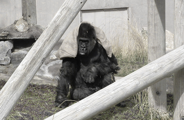
| i like how the ape is framed in the two logs, i might have cropped more of the left and right out of the photo and zoomed in some more on the ape. |
|
 Photographer found comment helpful. Photographer found comment helpful. |
|
|
04/26/2003 12:13:01 PM |
| the colour of the surroundings seem a bit washed out. |
|
|
|
04/25/2003 01:46:40 PM |
|
|
|
04/24/2003 05:31:13 AM |
| There are some really bad puns being pulled out this week - but congratulations, you're in the lead so far :) |
|
|
|
04/23/2003 07:03:46 PM |
| The colors are a bit too drab for anything to pop. I think a little more contrast would've made this more effective. |
|
| Photographer found comment helpful. |
|
|
04/23/2003 03:50:52 PM |
| The two beams crossing in front give us a sense of this limited "habitat." Nonethless, the subject is making the best of it with a game (?) The B&W works well - makes the ape the stand out. |
|
| Photographer found comment helpful. |
|
|
04/23/2003 01:43:36 PM |
| Nice subject. In my opinion, I would have desaturated a bit more to remove all traces of color, or brought back enough to emphasize a traditional sepia effect. |
|
| Photographer found comment helpful. |
|
|
04/23/2003 01:12:15 PM |
| I think in your attempts to increase contrast, you lightened the wood too much and darkened your main subject too much losing detail in the gorilla. I do however, like your idea to have kept the grass with some color and I do like the composition alot. |
|
| Photographer found comment helpful. |
|
|
04/23/2003 10:45:25 AM |
|
Home -
Challenges -
Community -
League -
Photos -
Cameras -
Lenses -
Learn -
Help -
Terms of Use -
Privacy -
Top ^
DPChallenge, and website content and design, Copyright © 2001-2025 Challenging Technologies, LLC.
All digital photo copyrights belong to the photographers and may not be used without permission.
Current Server Time: 03/12/2025 07:29:55 PM EDT.