| Author | Thread |
|
|
05/06/2003 11:23:24 PM |
CRITIQUE CLUB CRITIQUE
by karmat
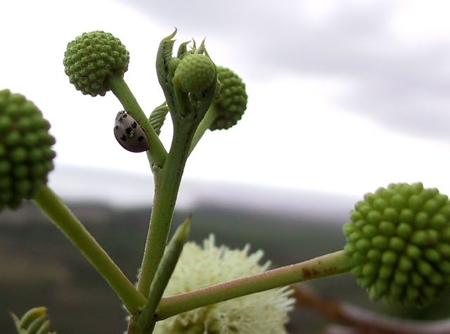
My very first impression of this shot was, "Not bad, but I though flora was over." Then, I saw the ladybug. So, on with the critique.
I think the depth of fied used here is awesome!! I like how the foreground is out of focus, the background is out of focus, but the middle buds and bug are in focus. Very nicely done, and effective, I think. The location of the stem with the ladybug on it also gives it a well-balanced feeling by not being directly in the middle, and the vertical "shoot" of the stem helps to lead the eyes from the bottom towards the top of the frame.
The colors here are simple, but fairly nice. The white sky, normally, would be detracting, but with the nice green of the plants it works okay, I think. (A blue sky would be nice too, though.) I do think, like many of your commenters, that the picture would be much more effective if the bug was colorful. He/she (whatever it is) looks muted gray to me, so it does blend into the background and doesn't seem to be the main focus of your shot, but rather a subsidiary part of it. If the thing had any color at all, it may have helped to desaturate everything but it in post processing. Since it isn't immediately noticeable, many voters don't or can't take a lot of time to vote, and they may not have seen it, and just assumed it didn't meet the challenge. That is unfortunate because it really is a nice shot.
Best to you in future challenges. |
|
Comments Made During the Challenge  |
|
|
04/29/2003 07:49:44 PM |
| I like the composition and the depth of field. Unfortunately the Ladybug is hard to see. It just screams for more red colour. Did you desaturate it? |
|
|
|
04/29/2003 02:01:57 AM |
| the flower seems to be the main subject, not the critter... |
|
|
|
04/29/2003 12:14:27 AM |
| Colors are good. Backgorund handled OK. A much closer composition would have been better. |
|
|
|
04/27/2003 09:45:40 AM |
| This would have done well for both challenges this week. The stormy skies make for a decent background, good capture! |
|
|
|
04/27/2003 12:37:06 AM |
| i like how this image was composed, nicely done |
|
|
|
04/26/2003 07:13:02 PM |
| Needs more cropping to emphasize bug. Nice shot of plant. |
|
|
|
04/25/2003 01:56:44 PM |
| Good job, i like the photo. |
|
|
|
04/25/2003 01:55:13 PM |
|
|
|
04/25/2003 10:27:12 AM |
|
|
|
04/24/2003 05:31:58 PM |
| I feel the bug is too small a part of this picture given the topic. I'd have cropped this to just the centre sectio where the bug is. |
|
|
|
04/24/2003 08:02:44 AM |
| The ladybug seems to be in shadow. Spot metering on the ladybug would possibly have brought it out more. Even though the background is nicely blurred it's a bit distracting since it is crooked. |
|
|
|
04/24/2003 06:08:49 AM |
| It's a little hard to make out the subject in this pic - I think there's a heart-shaped marking on the body and that this is where the title comes from, but it's so small I can barely make it out! |
|
|
|
04/23/2003 06:43:41 PM |
| I would have liked more colour in the ladybug. Interesting angle though. |
|
|
|
04/23/2003 02:33:31 PM |
| The ladybug is almost lost in white background. Lowering the shot might have helped contrast the insect. Just my thoughts. |
|
|
|
04/23/2003 02:31:03 PM |
| Nice image. Good jobe with the focus and the way that the background in displayed in the image. I like it. |
|
Home -
Challenges -
Community -
League -
Photos -
Cameras -
Lenses -
Learn -
Help -
Terms of Use -
Privacy -
Top ^
DPChallenge, and website content and design, Copyright © 2001-2025 Challenging Technologies, LLC.
All digital photo copyrights belong to the photographers and may not be used without permission.
Current Server Time: 03/13/2025 01:57:03 AM EDT.