| Author | Thread |
|
|
06/24/2005 01:46:25 AM |
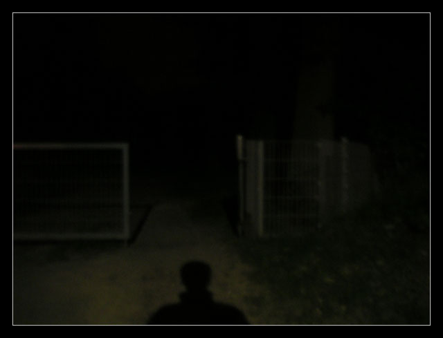
| Very Silent Hillish shot... I like the creepyness of it :) |
|
Comments Made During the Challenge  |
|
|
06/21/2005 01:56:59 PM |
| I think the border just ruins this |
|
|
|
06/21/2005 09:48:38 AM |
| I like the definition of the shadow juxtaposed with the clearly visable yet slightly blurred gate and the darkness beyond it -- intangible tangibility. (A little more cropped off the right side might be in order.) |
|
|
|
06/19/2005 05:06:32 PM |
|
|
|
06/17/2005 04:42:12 PM |
| another photo that i thought was a lense cap joke, but turns out there is a(n actually quite good) image that hasbeen hidden by over zealous darkness - shame that! |
|
 Photographer found comment helpful. Photographer found comment helpful. |
|
|
06/16/2005 08:57:26 PM |
| creepy, though not very focused |
|
| Photographer found comment helpful. |
|
|
06/16/2005 05:13:09 PM |
| I can barely see anything. This is a darkness challange so I guess that works, but maybe just a teensy bit lighter would have helped. |
|
| Photographer found comment helpful. |
|
|
06/15/2005 03:21:48 PM |
|
| Photographer found comment helpful. |
|
|
06/15/2005 02:39:18 PM |
| It's definitely dark. I like the concept, but it might have worked better for me if there was a little more detail available. And because of the faintness of the image, the white in the border distracts from the image. |
|
| Photographer found comment helpful. |
|
|
06/15/2005 11:50:46 AM |
| The fence should have been more in focus. I really like this idea and image. |
|
| Photographer found comment helpful. |
|
|
06/15/2005 10:53:02 AM |
|
Home -
Challenges -
Community -
League -
Photos -
Cameras -
Lenses -
Learn -
Help -
Terms of Use -
Privacy -
Top ^
DPChallenge, and website content and design, Copyright © 2001-2025 Challenging Technologies, LLC.
All digital photo copyrights belong to the photographers and may not be used without permission.
Current Server Time: 04/26/2025 08:48:01 PM EDT.