| Author | Thread |
Comments Made During the Challenge  |
|
|
06/17/2005 07:44:31 AM |
| I am confused as to whether I should give this a 10 or a 1. Interesting idea, in a way, but you wouldn't catch me putting it on my wall. |
|
|
|
06/17/2005 03:28:50 AM |
| Well, maybe you're just trying to stir up a reaction, so my reaction is...although maybe an interesting idea, IMO, this presentation is not executed very well, and I don't really find the image stimulating, positively or negatively. Oh, and what is "blavk" ??? I normally could care less about spelling, but if you're going to let it all out and try to be 'edgy' or whatever, perhaps more care should go into a simple word like black in your title, an important part of an image like this. Of course, it it is supposed to be b-l-a-V-k, then replace that last sentence with...I don't get it??? |
|
|
|
06/17/2005 01:38:52 AM |
I didnt hear it.. echoes back to you!
|
|
|
|
06/16/2005 10:03:44 PM |
|
|
|
06/16/2005 09:50:25 PM |
| What is this supposed to be, may i ask?? |
|
|
|
06/16/2005 09:33:59 PM |
|
|
|
06/16/2005 08:50:45 PM |
ummmmmm
if this is what darkness means to you...ok |
|
|
|
06/16/2005 08:23:20 PM |
Base score 5
I don' get it -1
Poor light/comp/proc -1
Total 3
|
|
|
|
06/16/2005 07:02:05 PM |
| A point up for humour, then down for misspelling. |
|
|
|
06/16/2005 06:28:42 PM |
| I might be, but I see little to like here, sorry. |
|
|
|
06/16/2005 05:43:25 PM |
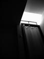
| I wasn't sure what to make of this image. I looked at it a few times befoer voting. Perhaps I missed something or you need some sort of knowledge about somethig to get the relvance of this. But I just felt it was not appropriate for the challenge. I have been unable to make a relationship between Darkness and this image other than it is mostly black. |
|
|
|
06/16/2005 05:17:02 PM |
|
|
|
06/16/2005 04:06:49 PM |
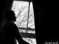
| Yes, but don't tell me you didn't want to be looked at, you little tease. Despite your antiestablishment attitude, you still went for a 'rule of thirds' placement, you closet traditionalist. |
|
|
|
06/16/2005 02:58:28 PM |
| Hehe, i think i'm looking at the brown :) |
|
|
|
06/16/2005 12:55:31 PM |
| he he dunno what to think |
|
|
|
06/15/2005 08:05:51 PM |
| Hahaha. Nice. Not sure if everyone else will find this as amusing as I do, but I enjoyed it. The lettering is a bit soft on focus and I think for the best impact it should be bold and bright. Good times. I gave a 5. |
|
|
|
06/15/2005 05:57:02 PM |
| Not much here. Try again. I have to give you a 1 only because I can't give you a 0. |
|
|
|
06/15/2005 10:06:07 AM |
|
|
|
06/15/2005 10:04:16 AM |
| Funny. But from a photographic perspcetive this competes with a lens cap. |
|
|
|
06/15/2005 07:28:17 AM |
|
|
|
06/15/2005 02:27:04 AM |
| Can't spell, either? It's just one inadequacy after another, huh? 1. |
|
Home -
Challenges -
Community -
League -
Photos -
Cameras -
Lenses -
Learn -
Help -
Terms of Use -
Privacy -
Top ^
DPChallenge, and website content and design, Copyright © 2001-2025 Challenging Technologies, LLC.
All digital photo copyrights belong to the photographers and may not be used without permission.
Current Server Time: 03/12/2025 04:54:29 PM EDT.