| Author | Thread |
Comments Made During the Challenge  |
|
|
06/21/2005 01:36:18 PM |
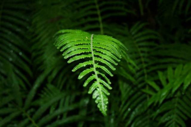
Nice picture. Would change the composition if it was me though.
Like put the leaf more to the left or right, depending on whatever else then comes into view |
|
|
|
06/21/2005 11:42:57 AM |
| I like the photo, but the fern is too centered and not quite in focus. |
|
|
|
06/20/2005 02:41:02 AM |
| cooool.... If the lighted leaf was a little more sharp I'd have given it higher. Awesome idea and shot. 8 |
|
|
|
06/18/2005 08:13:35 PM |
| The leaf looks out of focus and is much too centered. Is that a flash in the dark? |
|
|
|
06/17/2005 02:10:41 AM |
| This photo is fine, but it just does not pop out to me. |
|
|
|
06/17/2005 01:47:30 AM |
| I'm a sucker for nice macro shots. The consistent vivid green in the whole shot is great. |
|
|
|
06/16/2005 08:40:06 PM |
| This was a great idea. Everybody knows that plants will s-t-r-e-t-c-h towards light. I get it and I like it. This is different from the other entries I have seen and that is a plus. I love it when photos are not what I expected to see. 6 |
|
|
|
06/16/2005 08:31:56 PM |
| Like the composition. Not enough focus to suite me. |
|
|
|
06/16/2005 08:28:17 PM |
| poor focus on the tip of the leaf. Nice composition, but a fairly average photo. 5. |
|
|
|
06/16/2005 07:56:34 PM |
| out of focus, use tripod if there isn't enough light. |
|
|
|
06/16/2005 12:47:34 AM |
| sorry, i don't really feel 'darkness' with this shot. |
|
|
|
06/15/2005 08:04:42 PM |
| I see the correlation to darkness and I think the idea is a great one. I'm not sure the composition pulls it off however. As a suggestion to try, I would go from a different angle, so the fern left is perpendicular to you --| it'd be sticking out that way instead of towards you, then if possible have most of it blending into a black background and use some placed light sources to shine down on the end of the fern so you see how it is in fact trying to reach the light, even better might be to have the light source shining at a spot just beyond the fern's reach to give the struggle a bit more oomph. As it is, the image has some lovely rich color but the focus is just a bit soft and I think the impact is soft too based on the title/idea it appears you're trying to convey. I gave a 4. |
|
|
|
06/15/2005 01:02:59 PM |
| Focus is a bit soft. Might be better if the subject wasn't centered. |
|
|
|
06/15/2005 12:42:58 PM |
| A bit too out of focus for me. I liket he concept, however to me, it isn't as strong an image without reading the title. |
|
|
|
06/15/2005 09:55:11 AM |
|
|
|
06/15/2005 05:48:30 AM |
| the tip should be in focus here. otherwise, great idea, well done. |
|
|
|
06/15/2005 01:30:36 AM |
| Nice idea. I wish it were more focused. |
|
Home -
Challenges -
Community -
League -
Photos -
Cameras -
Lenses -
Learn -
Help -
Terms of Use -
Privacy -
Top ^
DPChallenge, and website content and design, Copyright © 2001-2025 Challenging Technologies, LLC.
All digital photo copyrights belong to the photographers and may not be used without permission.
Current Server Time: 03/12/2025 04:04:58 PM EDT.