| Author | Thread |
|
|
06/27/2005 04:24:02 PM |
Critique Club Comment
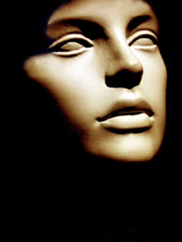
Composition:
I really like the crop of this image and the use of black, it gives a real feeling of darkness and fits the challenge well. There is a lot of black space below the chin, which makes for a very striking photograph, but I am not sure that I may have left a little more of the top of the head present.
You didn�t take full advantage of the 640px width or height limits (yours is 345px X 500px) or the 150kb file size (65.65 kb) which I feel lets the viewer see your image at its best.
Camera Work:
The lighting is very good but there are a few hot spots, bottom lip, above the top lip, bridge of the nose and the top of the eye lids. awpollard made a good suggestion for a home made soft box to which would be simple to construct. The focus is too soft and even if this was by choice you will and I feel have been voted down because of it.
Post-Processing:
You didn't post any info here, but depending what type of software you are using, look at curves with the historgram to help reduce the hot spots some.
My Opinion:
Personally, I feel that the subject used is too simple and the focus to soft but you captured darkness. You might try to use real person next time or a subject matter that has some textural interest. You chose a very simple subject and as ergates stated it would have had to be pretty special to score well. You received some very good comments during the challenge that should help you for the next challenges. The average vote on this challenge was 5.03 and your photo had the potential to better that.
This is one of my first critiques and I hope you find it helpful. Just as you are looking for some help from the Critique Club I would enjoy any feed back you have to improve my critiques. If you have any comments or questions about this critique, please feel free to contact me via the PM system.
|
|
Comments Made During the Challenge  |
|
|
06/20/2005 06:32:04 PM |
|
|
|
06/19/2005 05:19:55 PM |
|
|
|
06/18/2005 05:30:12 AM |
| I'm sorry, but pictures of masks and figurines need to be pretty special to make it. |
|
|
|
06/17/2005 09:46:25 PM |
| Great lighting. Well composed. |
|
|
|
06/17/2005 02:45:46 PM |
| Good concept. The head is probably a little soft focused for many voters but it is not terribly overexposed. You might cconsider around 10-20 percent burning in on the bridge of the nose, upper lip and chin. |
|
|
|
06/17/2005 08:07:19 AM |
| I'm afraid this shot won't rate very well as it's a mask/statue, which is kind of like taking a photo of a statue, which I did once & got hammered for it. Good luck. |
|
|
|
06/16/2005 10:11:36 PM |
| there was 4 photos in this challenge that represented darkness to me on a subconsious level, almost like a childhood fear thing. This was one of them. It may not score as high as I voted it, but it reaches depths for me. Thanks for entering it. GL |
|
|
|
06/16/2005 09:33:32 PM |
| THis is one of my favorite entries!! |
|
|
|
06/16/2005 01:41:03 AM |
| Nice crop and composition, I might have used even softer light...possible shine the light through a white bed sheet or the likes. As bright as it is my first thought is that it is plastic mask. A little softer diffused light would add to the mystic of the shot, I believe, making it more of a what is it than a what it is. |
|
|
|
06/15/2005 02:28:42 PM |
| don't you know i have a phobia of pupiless statues ! ughhhh! |
|
|
|
06/15/2005 09:29:46 AM |
| Seems slightly out of focus... But an interesting composition, and I like the lighting. |
|
|
|
06/15/2005 12:13:08 AM |
| Grabs me off the thumb. Surreal, fragile. I like the crop, with a bit of space underneath the chin. |
|
Home -
Challenges -
Community -
League -
Photos -
Cameras -
Lenses -
Learn -
Help -
Terms of Use -
Privacy -
Top ^
DPChallenge, and website content and design, Copyright © 2001-2025 Challenging Technologies, LLC.
All digital photo copyrights belong to the photographers and may not be used without permission.
Current Server Time: 03/12/2025 02:25:05 AM EDT.