| Author | Thread |
Comments Made During the Challenge  |
|
|
06/21/2005 09:16:33 PM |
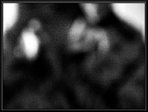
| I see what you were going for here, but it doesn't work for me. Would like to have a tad more focus to make out the figures a bit more. Just my opinion though. |
|
 Photographer found comment helpful. Photographer found comment helpful. |
|
|
06/20/2005 11:19:12 PM |
| 2nd pass to make comments...great take on the challenge. i dont usually care for noise in a photo but in this case it adds to the image. excellent use of B&W.*9* voted a 10 for above reasons and a bump for creativity |
|
| Photographer found comment helpful. |
|
|
06/20/2005 11:05:00 AM |
Concept for the challenge is good but the composition might not make it with the voters. Good full range of tone from black to white.
Excessively and purposely grainy images typically do not do well at DPC. That is because voters tend to think that is done more so to mask poor quality image than to make an artistic statement in an abstract way.
It won't be because voters do not "get it" but rather that they do not feel that you put much effort into the composition and that it is not 'true' high quality that they give it a lower score. |
|
| Photographer found comment helpful. |
|
|
06/18/2005 10:54:46 PM |
| Nice concept. Hope you don't speak from experience. |
|
| Photographer found comment helpful. |
|
|
06/17/2005 10:22:20 AM |
| i like the idea.....but without the title it mean little |
|
| Photographer found comment helpful. |
|
|
06/17/2005 07:06:33 AM |
| I understand the blur here, but it is also very grainy. As an image depicting blindness it does a good job but the image needs more smoothing to take away the grain. |
|
| Photographer found comment helpful. |
|
|
06/16/2005 10:16:07 PM |
|
| Photographer found comment helpful. |
|
|
06/16/2005 10:05:01 PM |
| Love the idea - straining to make out what the camera's looking at - but that's the idea of course. As an avid reader this conveys darkness to me;) |
|
| Photographer found comment helpful. |
|
|
06/16/2005 08:55:44 PM |
| The sharp border servers to emphasis the blurriness of the photo - well done. 8 |
|
| Photographer found comment helpful. |
|
|
06/16/2005 06:17:32 PM |
| I'm sorry, but this didn't move me at all. |
|
| Photographer found comment helpful. |
|
|
06/16/2005 05:18:41 PM |
| I think the idea behind this photo is great. I do think that if the subject were more recognizable (it took me a minute to realize that it was likely your reflection in some surface) that the photo would be more effective. You earn points for being creative, though - this is one angle I haven't seen till now in my voting. :) |
|
| Photographer found comment helpful. |
|
|
06/16/2005 03:27:39 PM |
| I can relate to that, and my eyes are only middle aged. Wouldn't mean anything without the title. I'll give you points for meeting the challenge. |
|
| Photographer found comment helpful. |
|
|
06/16/2005 09:01:10 AM |
| This is interesting....made me stop and think....a different way to approach the subject of darkness |
|
| Photographer found comment helpful. |
|
|
06/15/2005 10:46:13 AM |
| I really like this! What an awesome idea. Well executed! |
|
| Photographer found comment helpful. |
|
|
06/15/2005 08:09:13 AM |
|
| Photographer found comment helpful. |
|
|
06/15/2005 04:15:37 AM |
| I like the concept but you should not need to rely on the title, maybe an eye shaped border or some way to convey the title through the photo would help. My 2c worth ... 5 |
|
| Photographer found comment helpful. |
Home -
Challenges -
Community -
League -
Photos -
Cameras -
Lenses -
Learn -
Help -
Terms of Use -
Privacy -
Top ^
DPChallenge, and website content and design, Copyright © 2001-2025 Challenging Technologies, LLC.
All digital photo copyrights belong to the photographers and may not be used without permission.
Current Server Time: 03/14/2025 10:21:36 PM EDT.