| Author | Thread |
Comments Made During the Challenge  |
|
|
06/25/2005 06:12:14 AM |
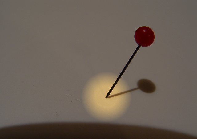
| the shadow in the lower half of the image really distracts from the subject and takes away the punch factor. |
|
 Photographer found comment helpful. Photographer found comment helpful. |
|
|
06/23/2005 08:19:11 AM |
| I can't really get the shadow at the bottom. It seems like a lens hood. The white of the canvas could be a lot brighter and the overall feel could be lighter. Nice idea worth redoing. 4 |
|
| Photographer found comment helpful. |
|
|
06/22/2005 11:28:07 PM |
| my goal is to comment on every photo in this challenge..heres urs..good luck. great focus and colrs but this is quite a boring photo for me personally and the shadow at the bottom is a distraction. i like that theres no noise in this photo...good job |
|
| Photographer found comment helpful. |
|
|
06/22/2005 07:18:56 PM |
| This concept makes me smile! Great idea. |
|
| Photographer found comment helpful. |
|
|
06/22/2005 05:20:46 PM |
| I have made 4 passes on this photo so far and it has finally started to grow on me. I like the composition, lighting, shadow. What I don't like is the dark area at the bottom - camera shadow or intentional? Nice job. |
|
| Photographer found comment helpful. |
|
|
06/22/2005 04:20:35 PM |
| Too plain, doesn't make me think metal. |
|
| Photographer found comment helpful. |
|
|
06/22/2005 12:14:21 PM |
| Doesnt scream "metal" to me like I think a challenge should. Nice though. |
|
| Photographer found comment helpful. |
|
|
06/22/2005 10:27:58 AM |
| with a title of to the POINT maybe you should show that, the POINT |
|
| Photographer found comment helpful. |
Home -
Challenges -
Community -
League -
Photos -
Cameras -
Lenses -
Learn -
Help -
Terms of Use -
Privacy -
Top ^
DPChallenge, and website content and design, Copyright © 2001-2025 Challenging Technologies, LLC.
All digital photo copyrights belong to the photographers and may not be used without permission.
Current Server Time: 03/13/2025 02:22:01 AM EDT.