| Author | Thread |
|
|
05/07/2003 11:30:31 PM |
Greetings from the Critique Club
By Inspzil
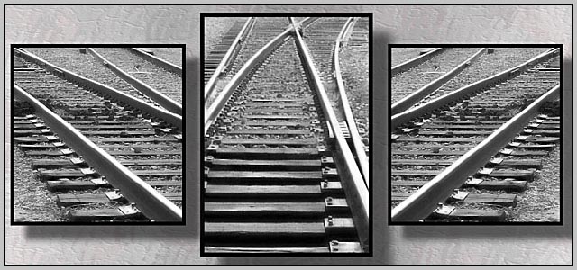
Composition - I like the single source with divergent lines coming off the common line. I like the background with the shadows of the pictures showing as well. I think it fits with the photos very well. The only thing that I'd like to see different about this picture is the middle frame being asymmetrical. I think if it were symmetrical with lines leading to the other 2 frames it would be a little more balanced. But really as is it works really well.
Technical - these are 2 very well taken photos that have a nice common theme. The greater DOF works well since the pieces of track are not trying to show an infinitely long path. The tops of all the frames are sort of blurred, but relatively clear compared to a shot with very shallow DOF.
Overall - Nice shots and a really well designed triptych. I really like the choice of background and the shadows behind the images. This is well conceived and well done. I think you've really done as well as this subject will allow, as its not the most compelling subject on earth. You did a really great job. Good work and good luck - Inspzil |
|
 Photographer found comment helpful. Photographer found comment helpful. |
Comments Made During the Challenge  |
|
|
05/04/2003 09:06:40 PM |
| These are all strong crisp shots that flow together wonderfully in this composition. Great work. 10 |
|
| Photographer found comment helpful. |
|
|
05/04/2003 08:03:40 PM |
| Very well done, the focus is really sharp and all three images make the same statement. |
|
| Photographer found comment helpful. |
|
|
05/02/2003 05:40:09 PM |
| Great shot. I can't find one thing wrong with it. You deserve a good score with this one. Good luck!!! |
|
| Photographer found comment helpful. |
|
|
04/29/2003 01:04:06 PM |
| I definitely like railroad theme photos :) This one is quite interesting as well... they layout is nice and the lines all seem to work nicely together... excellent work :) - setzler |
|
| Photographer found comment helpful. |
|
|
04/28/2003 01:10:29 PM |
| I like your images, but the use of the drop shadows on the background kind of distract, especialy the one between the left and center photos. The idea seems sound, but the asymmetrical crop in the middle picture is kind of distracting. |
|
| Photographer found comment helpful. |
|
|
04/28/2003 12:36:10 PM |
| Good use of line for focus here. |
|
| Photographer found comment helpful. |
|
|
04/28/2003 12:06:31 PM |
| the lines are a bit too disjointed |
|
| Photographer found comment helpful. |
|
|
04/28/2003 12:04:46 PM |
| Nice and simple idea. My preference would be for the images to be the same height and for the background to be plain. |
|
| Photographer found comment helpful. |
|
|
04/28/2003 11:41:00 AM |
| Very Nice. I love the grayscale. The lines are very attractive. |
|
| Photographer found comment helpful. |
|
|
04/28/2003 11:07:34 AM |
| Interesting composition. The angles on each side draw your attention back ot the center. Nice work! |
|
| Photographer found comment helpful. |
|
|
04/28/2003 12:48:39 AM |
| Very nicely done. I don't think I would change anything looks great. |
|
| Photographer found comment helpful. |
Home -
Challenges -
Community -
League -
Photos -
Cameras -
Lenses -
Learn -
Help -
Terms of Use -
Privacy -
Top ^
DPChallenge, and website content and design, Copyright © 2001-2025 Challenging Technologies, LLC.
All digital photo copyrights belong to the photographers and may not be used without permission.
Current Server Time: 03/12/2025 02:14:40 AM EDT.