| Author | Thread |
Comments Made During the Challenge  |
|
|
06/02/2002 02:01:00 PM |
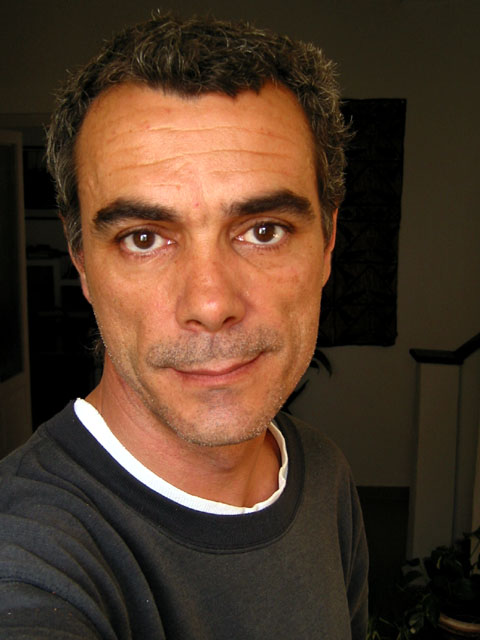
| I liked this image a little better in the thumbnail because all of the blacks faded together. Could you adjust the levels on this shot to get the darks just a little darker so that they did? I think that effect would really make this image stand out. As it is, I'm just a little distracted by the objects still slightly visible in the background. |
|
|
|
06/01/2002 09:12:00 PM |
| What's often the most difficult subject, handled well. |
|
|
|
05/31/2002 06:15:00 AM |
| Nice portrait of a weathered man. You would have done better with some kind of a back drop rather than being able to see parts of your house. Lighting might work well in some circles but I would have prefered a half lit face for more dramatic effect. Oh yeah, the self-portrait challenge was a few weeks ago. ;) |
|
|
|
05/30/2002 03:57:00 PM |
| Great colors and lighting, the white undershirt is a slight distraction but nothing major. |
|
|
|
05/29/2002 01:04:00 AM |
Good shot...Could of darkened the background though. Otherwise great portrait.
|
|
|
|
05/29/2002 12:33:00 PM |
| Not much thought/time looks like it went into this. |
|
|
|
05/28/2002 05:32:00 PM |
| I love the catchlights you gave yourself! This is really well lit, especially for a self-portrait. Good choice for a model! |
|
|
|
05/28/2002 05:23:00 PM |
| would be better on a solid background, i think. the face is nicely lit and well shot, but the background clutter detracts quite a bit from this shot. |
|
|
|
05/28/2002 05:13:00 PM |
| Good shot, but background on right distracts me. |
|
|
|
05/28/2002 01:35:00 PM |
Good color, but in this case, the background shows up too much. (Are you an infrequent shaver, too?) Notice the t-shirt wash out on the left.
Photo 9 Creativity 6 People 9 total 8 (if you could have wiped out the background, this would have been a 10, and lose the t-shirt, it's toooooo white for this shot) |
|
|
|
05/28/2002 09:04:00 AM |
| too much clutter in the background for this to really be effective. |
|
|
|
05/28/2002 06:56:00 AM |
| I like the starkness of the photo. Others may disagree, but I would have placed the subject in the centre of the photo. The blank space to the right does nothing for me. Front of the forehead looks just a little bit too shiny. |
|
|
|
05/27/2002 04:54:00 PM |
| This people has a *smile, *smerk that makes this a charming photo. Nice light, good work. |
|
|
|
05/27/2002 09:57:00 AM |
This is a good self-portrait.. i like it! You look absolutely thrilled :).. lol
|
|
|
|
05/27/2002 09:48:00 AM |
| the white shirt - i like - contrast - nice |
|
|
|
05/27/2002 09:08:00 AM |
| All black background is good contrast to face. |
|
|
|
05/27/2002 08:50:00 AM |
| you missed the short bus by about four weeks. i was hoping lang would re-run some of the challenges, though. |
|
Home -
Challenges -
Community -
League -
Photos -
Cameras -
Lenses -
Learn -
Help -
Terms of Use -
Privacy -
Top ^
DPChallenge, and website content and design, Copyright © 2001-2025 Challenging Technologies, LLC.
All digital photo copyrights belong to the photographers and may not be used without permission.
Current Server Time: 03/13/2025 03:36:14 AM EDT.