| Author | Thread |
Comments Made During the Challenge  |
|
|
06/26/2005 10:17:19 PM |
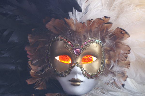
| This image isn't as clear and colorful as I would have expected. The feathers look very hazy. Can you reshoot this with less harsh lighting and post it to your portfolio? - 4 |
|
|
|
06/24/2005 12:52:32 PM |
Unique concept challenging the viewer to carefully consider exactly what the fantasy is. Generally the colors are good and the firey eyes are the strength of the composition. This image has no hot spots that hurt the composition.
Meets the challenge but some voters probably will not think it all that exciting. Who cares about them, anyway? :)
A few technical things...
The mask is slightly off center and tilted downward on the right side. The human eye wants subconciously to correct for those things and even if the viewer does not conciously recognize it they will be bothered. It is more pleasing to the viewer if the mask is absolutely centered and the frame rotated slightly counterclockwise for leveling.
The chin is right at the bottom on the frame. You might consider raising it in the frame so the chin is not so close to the edge. You might consider recomposing for the rule of thirds for added visual interest.
The color of the eyes unnaturally bleeds over onto the rest of the mask. This may be purposeful for effect but most viewers will probably interpret this as an image defect. You can easily clone around the edge of the eyes to remove edge effect and that might even make the eyes seem more intense after the edge distraction is removed.
The biggest issue is with contrast. If you apply a simple autocontrast adjustment you will see a vast improvement that adds considerable "pop" to the composition. It could, however, result in lost detail so you may want to experiment with various techniques to improve the contrast without significant loss of detail. |
|
 Photographer found comment helpful. Photographer found comment helpful. |
|
|
06/24/2005 03:51:43 AM |
| I don't think I like the eyes. Otherwise a great photo. |
|
|
|
06/22/2005 07:06:37 PM |
| i think you would have impast of the image and mask if it was on all white or all black .. probably more on all white ... and i wish the glowing part was more in focus |
|
|
|
06/22/2005 05:40:41 PM |
| a little work in levels and this would have popped! |
|
| Photographer found comment helpful. |
|
|
06/22/2005 12:27:55 AM |
| little less brightness and a little more contrast here for me..still deserves a 9 |
|
| Photographer found comment helpful. |
|
|
06/20/2005 10:07:40 PM |
| Love the concept here, but could use a little more contrast on the mask and the eyes could be toned down just a tad! Stll Great! |
|
| Photographer found comment helpful. |
|
|
06/20/2005 03:29:26 PM |
| Seems like the blacks are a bit washed out. Interesting concept and execution, though. |
|
| Photographer found comment helpful. |
|
|
06/20/2005 09:39:00 AM |
This doesn't need the addition of the fiery eyes. Theres enough matierial without that over the top element.
The rest of the image just needs a bit of hard directional light from the left. With the left half of the face in bright ligh and the right side in shadow. |
|
| Photographer found comment helpful. |
|
|
06/20/2005 09:32:48 AM |
| What if the mask had a little more contrast and was even further whited out? Would that make the eyes more dramatic? The mask is so soft. |
|
| Photographer found comment helpful. |
|
|
06/20/2005 03:10:47 AM |
| ell photgraphed and effective , This is quite mystical .9 |
|
| Photographer found comment helpful. |
Home -
Challenges -
Community -
League -
Photos -
Cameras -
Lenses -
Learn -
Help -
Terms of Use -
Privacy -
Top ^
DPChallenge, and website content and design, Copyright © 2001-2025 Challenging Technologies, LLC.
All digital photo copyrights belong to the photographers and may not be used without permission.
Current Server Time: 03/12/2025 07:49:27 PM EDT.