| Author | Thread |
Comments Made During the Challenge  |
|
|
06/27/2005 11:45:10 PM |
| I really like this shot but I think it would benifit with more exposure. Seems a little dark to me. |
|
 Photographer found comment helpful. Photographer found comment helpful. |
|
|
06/27/2005 08:44:36 PM |
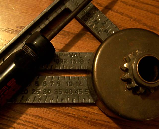
| Lovely placement composition with just enough exposure of each object to suggest its purpose and value. Improvement might come from adjusting the temperature slightly cooler. The ruddy hue is warm and friendly, but it would be nice if the blade of the tri-square were a wee bit more metallic than wood-like in tonal texture. It seems almost greenish-yellow where it might affect more contrast and stand out better if slightly more bluish. 8. |
|
| Photographer found comment helpful. |
|
|
06/22/2005 07:57:42 PM |
| Cool subjects but a very distracting background. |
|
| Photographer found comment helpful. |
|
|
06/22/2005 04:50:35 PM |
|
| Photographer found comment helpful. |
|
|
06/22/2005 10:34:05 AM |
| Good lighting and nice composition. |
|
| Photographer found comment helpful. |
|
|
06/22/2005 07:33:41 AM |
| Nice composition, but that one shadow is really distracting. |
|
| Photographer found comment helpful. |
Home -
Challenges -
Community -
League -
Photos -
Cameras -
Lenses -
Learn -
Help -
Terms of Use -
Privacy -
Top ^
DPChallenge, and website content and design, Copyright © 2001-2025 Challenging Technologies, LLC.
All digital photo copyrights belong to the photographers and may not be used without permission.
Current Server Time: 03/12/2025 06:19:19 AM EDT.