| Author | Thread |
|
|
05/08/2006 01:16:07 PM |
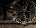
hey, I got a picture that looks almost like yours... |
|
 Photographer found comment helpful. Photographer found comment helpful. |
|
|
08/22/2005 11:00:18 AM |
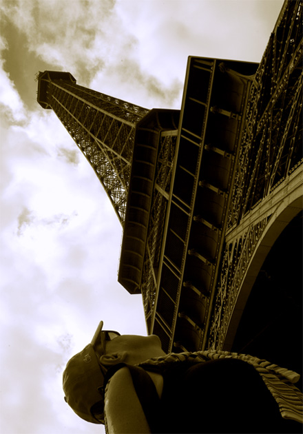
| Great perspective and I really like the tones. The person is somewhat of a distraction, but I can see how it adds to the interest for some. |
|
| Photographer found comment helpful. |
Comments Made During the Challenge  |
|
|
06/28/2005 09:12:52 PM |
|
| Photographer found comment helpful. |
|
|
06/28/2005 08:25:59 PM |
|
| Photographer found comment helpful. |
|
|
06/28/2005 11:01:13 AM |
| Great perspective, but I think it would have been cleaner without the person in the bottom edge of the photo--from a graphic standpoint. |
|
| Photographer found comment helpful. |
|
|
06/27/2005 12:19:53 PM |
| Creative composition. I like it. |
|
| Photographer found comment helpful. |
|
|
06/27/2005 05:47:44 AM |
| i like the perspective of how tall this is, sepia works well with it too |
|
| Photographer found comment helpful. |
|
|
06/26/2005 10:04:50 AM |
| Nice angle. Other than depicting the true awe of the tower, it does create an impact by the gazer forcing the focus to the object "Metal". ALL ROUND stunning. |
|
| Photographer found comment helpful. |
|
|
06/24/2005 06:08:49 PM |
great angle.
I also like what you chose to shoot for this challenge.
very nice |
|
| Photographer found comment helpful. |
|
|
06/24/2005 02:55:04 AM |
| the tourist doesn't add much... |
|
| Photographer found comment helpful. |
|
|
06/24/2005 12:12:13 AM |
| I love the sepia. I dont know about the angle though. Something tells me I like but, the the other side of me is distracted by the angle, which takes away from the overall feel of it. Great shot though!!! |
|
| Photographer found comment helpful. |
|
|
06/23/2005 09:22:04 PM |
We all know that this is a metal challenge. Excluding the word "metal" would reflect a differant perspective, and strengthen the title.
nice comp, nice dof, nice motion, blacks nice, whites need help, nice lines, nice job |
|
| Photographer found comment helpful. |
|
|
06/23/2005 05:00:55 PM |
| Another entry. I thought this would appear. Good view. Color? Less of the person? This was not the dynamite I expected but it has the subject clear. |
|
| Photographer found comment helpful. |
|
|
06/23/2005 04:29:44 PM |
| need to rotate image to the right..6 |
|
| Photographer found comment helpful. |
|
|
06/23/2005 01:14:58 PM |
| Rule of thirds, leading lines .. you got it all! Good shot. |
|
| Photographer found comment helpful. |
|
|
06/23/2005 08:20:32 AM |
| You got a sore neck now? LOL I like the the composition and the toning. I'll rate it a 7. |
|
| Photographer found comment helpful. |
|
|
06/22/2005 09:45:19 PM |
| Great idea to give a sense of height however I feel that the angle is too acute. I think the image needs to be rotated 90 degrees clockwise. |
|
| Photographer found comment helpful. |
|
|
06/22/2005 08:24:38 PM |
| would have liked it better without the person |
|
| Photographer found comment helpful. |
|
|
06/22/2005 07:24:08 PM |
| Nice composition - quite a moody tower shot, certainly conveys it's awesome size well |
|
| Photographer found comment helpful. |
|
|
06/22/2005 06:43:11 PM |
| Love this. Not sure if the person adds or detracts. Love the tones, POV, composition. Great job! 9- good luck in the challenge! |
|
| Photographer found comment helpful. |
|
|
06/22/2005 02:18:45 PM |
|
| Photographer found comment helpful. |
|
|
06/22/2005 11:52:30 AM |
| The person is distracting in this photo. 6 |
|
| Photographer found comment helpful. |
|
|
06/22/2005 10:05:30 AM |
| Wow...Dramatic angle/POV. I like the hues and tones in this one. Nice work. |
|
| Photographer found comment helpful. |
|
|
06/22/2005 09:34:36 AM |
| I like the shot better before the person loaded... |
|
| Photographer found comment helpful. |
|
|
06/22/2005 03:02:05 AM |
| I think I would have cropped the person out, well done and good luck |
|
| Photographer found comment helpful. |
|
|
06/22/2005 02:52:01 AM |
| I opened this picture and rotatd it in my picture viewer and I liked it better the way you initially shot it. Just my opinion but I think that you tried to make more of this and actually made it worse. (sorry) |
|
| Photographer found comment helpful. |
|
|
06/22/2005 01:44:45 AM |
| Not crazy about the olive green. Great perspective, but it's way too dark. |
|
| Photographer found comment helpful. |
|
|
06/22/2005 01:08:22 AM |
| love this picture...I probably would have scored it higher than a seven if the person wasn't in it. But still a great pic! |
|
| Photographer found comment helpful. |
Home -
Challenges -
Community -
League -
Photos -
Cameras -
Lenses -
Learn -
Help -
Terms of Use -
Privacy -
Top ^
DPChallenge, and website content and design, Copyright © 2001-2025 Challenging Technologies, LLC.
All digital photo copyrights belong to the photographers and may not be used without permission.
Current Server Time: 03/12/2025 07:17:30 PM EDT.