| Author | Thread |
Comments Made During the Challenge  |
|
|
06/28/2005 08:07:23 PM |
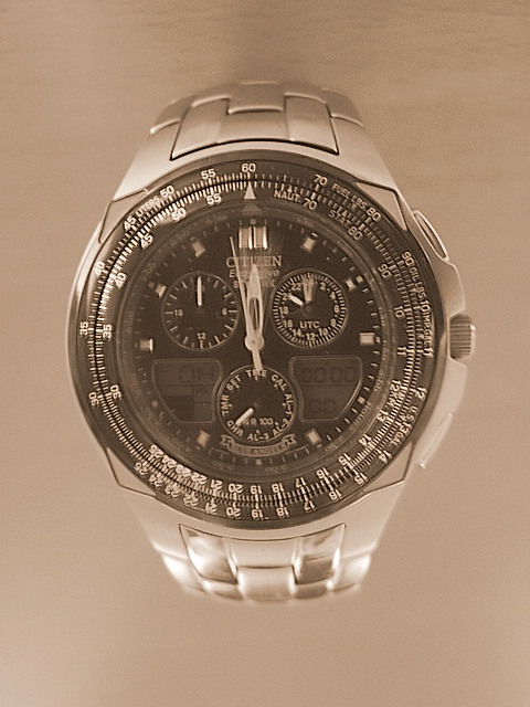
| This shot looks a bit flat and soft focused. Try increasing the contrast - and maybe go with a slightly less pink hue. |
|
 Photographer found comment helpful. Photographer found comment helpful. |
|
|
06/26/2005 04:04:05 AM |
| Just love seeing a watch face like this, you could have sharpened it a little more though |
|
| Photographer found comment helpful. |
|
|
06/22/2005 09:38:00 PM |
| my goal is to comment on every photo in this challenge..heres urs..good luck..nice color here but looks like it might have a slight camera shake |
|
| Photographer found comment helpful. |
|
|
06/22/2005 10:37:40 AM |
| The watch is a little bit crooked in the frame. If it were a little more so, I would think it was purposefully so, but as it is it looks like it's just not precisely aligned. |
|
| Photographer found comment helpful. |
|
|
06/22/2005 08:53:33 AM |
| Was this shot taken upside down? There's something disturbing about the shading. Also a bit of blurring on the dial and bit more contrast might improve the shot. |
|
| Photographer found comment helpful. |
|
|
06/22/2005 05:59:46 AM |
| Why the colour cast? Some shine to the watch would have been nice, but the motion implied adds some style. Good shot. |
|
| Photographer found comment helpful. |
Home -
Challenges -
Community -
League -
Photos -
Cameras -
Lenses -
Learn -
Help -
Terms of Use -
Privacy -
Top ^
DPChallenge, and website content and design, Copyright © 2001-2025 Challenging Technologies, LLC.
All digital photo copyrights belong to the photographers and may not be used without permission.
Current Server Time: 03/12/2025 08:50:51 AM EDT.