| Author | Thread |
|
|
03/23/2007 08:11:35 PM |
This is *so* cool.
Too bad it didn't place higher, I guess people thought it didn't have enought metal or something :P |
|
|
|
02/22/2007 12:35:36 PM |
| I've been there more than 100 times. cool shot to bad it didn't go further, would've been more gripping if it was shot lower to the top stare and was wider angle. but i know you can only do so much with the f717. |
|
|
|
02/22/2007 09:20:48 AM |
| Simply amazed that this image did not do better in the challenge it was shot for. I find it to be a very dynamic and eye-catching shot! |
|
Comments Made During the Challenge  |
|
|
06/28/2005 09:08:22 PM |
| Totally interesting picture. |
|
|
|
06/27/2005 12:27:43 PM |
| This is nice. Refreshingly creative after way too many rusty chains and machine parts. |
|
|
|
06/26/2005 03:39:41 AM |
| beautiful colors and composition |
|
|
|
06/25/2005 03:22:27 PM |
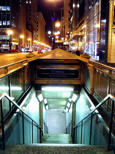
| I notice the city first, then the metal stairway. The image is basically cut in half, half being the subway and half being the city. In order to give more weight to the main subect, increase the amount of the frame it takes up. |
|
|
|
06/24/2005 03:55:09 PM |
| light warmth contrast and composition are very nice |
|
|
|
06/24/2005 10:59:01 AM |
| this is a cool use of color: 7 |
|
|
|
06/23/2005 11:24:29 PM |
| Beautiful. Nice contrast between the cold blue of the subway and the warm street tones. I'd like to see it cropped a little closer on top to below the glare in the center |
|
|
|
06/23/2005 04:25:53 PM |
| my goal is to comment on every photo in this challenge..heres urs..good luck. different perspective..refreshing |
|
|
|
06/23/2005 04:10:27 PM |
| Nice contrasted shot with great lines to direct the eye. |
|
|
|
06/22/2005 08:12:36 PM |
| Great colour and exposure - perhaps needs a fraction of counter-clockwise rotation to square it up. |
|
|
|
06/22/2005 04:58:39 PM |
| Lovely, not sure how topical it is, but what the.... |
|
|
|
06/22/2005 04:48:10 PM |
| Too centered. Good subject. |
|
|
|
06/22/2005 02:59:38 PM |
| I like the color difference between the levels. |
|
|
|
06/22/2005 01:23:14 PM |
|
|
|
06/22/2005 12:54:45 PM |
| Great colour difference, beautiful picture all in all, but the metal is not very obvious. |
|
|
|
06/22/2005 12:37:12 PM |
| just wonderful! Love the different colors between the nighttime urban scene above and the florescent lighting in the subway! Nice work! |
|
|
|
06/22/2005 08:34:37 AM |
| wooooooooooooow, nice metering, i like the colour contrast, good luck |
|
|
|
06/22/2005 08:00:48 AM |
| would like to see more of the top portion cropped and keep the focus on the lower portion...6 |
|
|
|
06/22/2005 06:38:39 AM |
| It feels tilted to the right a bit. I love two parts; the simultaneous view of the subterranean and surface world with the two different color themes for each. But now I am just verbalizing what we can all see. Nice job. |
|
|
|
06/22/2005 01:38:13 AM |
| Nice lighting. Lots of vibrant coloration. |
|
|
|
06/22/2005 01:37:04 AM |
The cool vs. warm color contrast really appeals to me.
Image appears tilted to the right, that's the only drawback I can find.
Bravo! |
|
Home -
Challenges -
Community -
League -
Photos -
Cameras -
Lenses -
Learn -
Help -
Terms of Use -
Privacy -
Top ^
DPChallenge, and website content and design, Copyright © 2001-2025 Challenging Technologies, LLC.
All digital photo copyrights belong to the photographers and may not be used without permission.
Current Server Time: 04/26/2025 01:37:21 PM EDT.