| Author | Thread |
Comments Made During the Challenge  |
|
|
05/03/2003 08:17:36 PM |
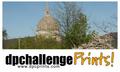
| Very attention-getting...could maybe use one more line of type explaining it is photos for sale... |
|
 Photographer found comment helpful. Photographer found comment helpful. |
|
|
05/02/2003 10:31:53 AM |
| To much color and dark overall. |
|
|
|
05/01/2003 03:54:10 PM |
| I must have had too much to drink, I'm seeing double. |
|
|
|
05/01/2003 02:32:06 PM |
Trendy but too much for me. I actually like the background (though not for this purpose) but think the rectangle seems out of place.
4, Kavey |
|
|
|
05/01/2003 11:44:42 AM |
Wow! Colour overload! My initial reaction here is:
"What on Earth is going on?!"
I also don't like the fact that all the large URLs are cut off at the end. |
|
|
|
05/01/2003 08:42:56 AM |
| Good design work, but does it tell someone who's never seen it what DPC Pritns is? |
|
|
|
05/01/2003 01:10:29 AM |
| Really sticks out with all the colors. Should have made the white in the "dpc.." box a little whiter. |
|
| Photographer found comment helpful. |
Home -
Challenges -
Community -
League -
Photos -
Cameras -
Lenses -
Learn -
Help -
Terms of Use -
Privacy -
Top ^
DPChallenge, and website content and design, Copyright © 2001-2025 Challenging Technologies, LLC.
All digital photo copyrights belong to the photographers and may not be used without permission.
Current Server Time: 03/14/2025 11:44:56 AM EDT.