| Author | Thread |
Comments Made During the Challenge  |
|
|
06/27/2005 05:58:49 AM |
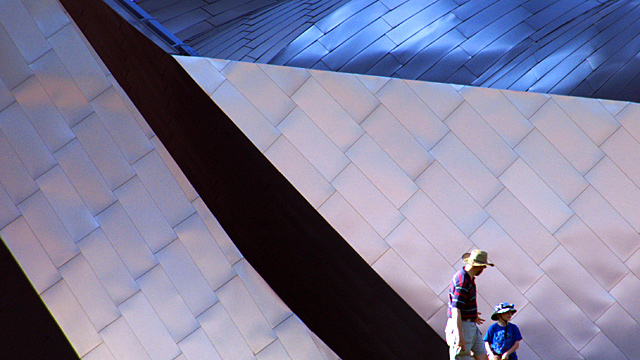
| like having the people in it, to give perspective. nice job |
|
 Photographer found comment helpful. Photographer found comment helpful. |
|
|
06/27/2005 02:45:56 AM |
| I think that the man and boy actually detract from this image. |
|
|
|
06/26/2005 04:08:43 AM |
| Difficult to appreciate what you're looking at... is this a building or something? |
|
|
|
06/25/2005 09:33:17 PM |
| honestly, i can't decide if i like the shot with people in it, or if i would have preferred none. i'm leaning toward no people, but since i'm not seeing it like that, it's hard to know. i love the blue metal on the upper right, wish it were more prominent. nice job. |
|
|
|
06/25/2005 12:24:11 PM |
| ah, frank gehry's buildings always make for good photos. Great idea, well executed. I particularly like the inclusion of people for a sense of scale. |
|
| Photographer found comment helpful. |
|
|
06/24/2005 10:58:35 PM |
| The addition of the human element is a terrific feature to this shot. An elegant, yet enigmatic composition that was well thought out and executed. Excellent work! |
|
| Photographer found comment helpful. |
|
|
06/24/2005 09:36:08 PM |
|
| Photographer found comment helpful. |
|
|
06/23/2005 10:14:24 PM |
| The people really add a lot to this shot by giving the metal structure a sense of scale. |
|
| Photographer found comment helpful. |
|
|
06/23/2005 05:18:54 PM |
| my goal is to comment on every photo in this challenge..heres urs..good luck.great viewpoint here...would have had a greater impact if the two people wernt there. that would have given this a more artistic look |
|
|
|
06/22/2005 10:33:40 PM |
| sorry - but this is a bit too abstract as I can not tell what this building or things is that the two people ar in front of. Plus, it would have been better if the people were not cut off at the bottom - this just looks poorly coomposed. |
|
|
|
06/22/2005 09:37:34 PM |
we all know its a "metal" challenge, why not just say, why not just call it "Heavy", it gives a differant perspective in the titleing.
Great lines, great comp, nice color, blacks good, whites need work, very nice overall. |
|
|
|
06/22/2005 09:11:36 PM |
| Very neat line and llighting. 8 |
|
| Photographer found comment helpful. |
|
|
06/22/2005 05:40:37 PM |
| I think I would have appreciated this more without the people. It is a very interesting photo for sure. In some context I am sure the people would be ok. But they just distract me from getting lost in the view of the image. I am constantly drawn to them and not the creative perspective. |
|
|
|
06/22/2005 01:00:50 PM |
| woooow, nice building and amazing fram, is it Desney Concert Hall ? |
|
| Photographer found comment helpful. |
|
|
06/22/2005 10:03:33 AM |
|
| Photographer found comment helpful. |
|
|
06/22/2005 01:58:42 AM |
| would have loved to have seen this picture without the people in it. |
|
Home -
Challenges -
Community -
League -
Photos -
Cameras -
Lenses -
Learn -
Help -
Terms of Use -
Privacy -
Top ^
DPChallenge, and website content and design, Copyright © 2001-2025 Challenging Technologies, LLC.
All digital photo copyrights belong to the photographers and may not be used without permission.
Current Server Time: 03/12/2025 11:23:09 AM EDT.