| Author | Thread |
Comments Made During the Challenge  |
|
|
06/28/2005 09:28:49 PM |
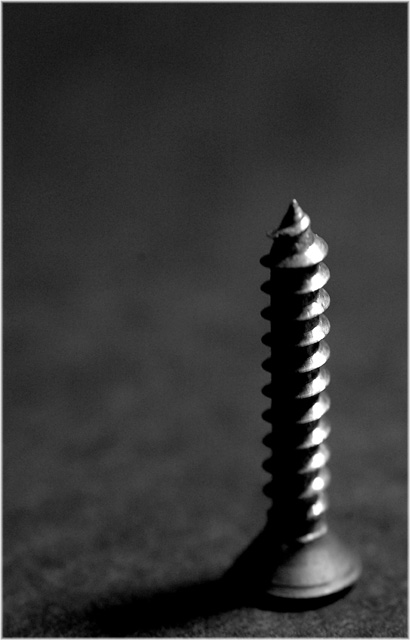
| I like the composition however it seems a little dark and the DOF looks like its either a little too shallow or in the wrong place. |
|
 Photographer found comment helpful. Photographer found comment helpful. |
|
|
06/28/2005 09:12:41 PM |
| love this. Simple and straight forward with good depth. POV great, DOF okay, like the tones and the lighting. Good luck on the challenge! 8 |
|
| Photographer found comment helpful. |
|
|
06/28/2005 01:42:06 PM |
| Love the title! Nice capture with the light and shadow. |
|
| Photographer found comment helpful. |
|
|
06/28/2005 10:45:01 AM |
Fits challenge=5
Color/lighting=1
DOF/focus=1 for DOF -1 for focus=0
Wow factor/uniqueness=0
Attractiveness=1
Man you focus killed this image. I like the position, lighting, and color tone, even the DOF but since the screw is too blurry I had to mark it down. Good attempt.
Good luck |
|
| Photographer found comment helpful. |
|
|
06/27/2005 06:40:21 PM |
| the focus is a bit funky in this shot. i think the set up and positioning are really good |
|
| Photographer found comment helpful. |
|
|
06/25/2005 12:01:25 AM |
| LOVE the title hahaha. Could have been a tiny bit shaper maybe, big fan of the composition! |
|
| Photographer found comment helpful. |
|
|
06/24/2005 01:41:09 AM |
| Just a tiny bit more depth of field and this would be a 10. Cool idea. |
|
| Photographer found comment helpful. |
|
|
06/23/2005 01:53:16 PM |
| I only wish the focus was a little more crisp - seems the top is in and the bottom is out. perhaps a slight change in perspective would help that. Other than that, real nice image. I like the lighting, placement of the subject. |
|
| Photographer found comment helpful. |
|
|
06/23/2005 01:12:15 PM |
| Nice composition, but the focus seems a bit soft. |
|
| Photographer found comment helpful. |
|
|
06/23/2005 08:43:29 AM |
| Like the placing, crop, color, would like more sharpness at base. Title is funny. |
|
| Photographer found comment helpful. |
|
|
06/22/2005 08:33:43 PM |
| I like the simplicity and the B&W. I'll rate it a 7. |
|
| Photographer found comment helpful. |
|
|
06/22/2005 06:47:21 PM |
| Love this idea! I even like the soft focus with it. |
|
| Photographer found comment helpful. |
|
|
06/22/2005 05:14:12 PM |
| Simplicity can work so well. This doesn't blow me away but it does make me stop and look and feel calm at the evident compositional balance. Nice. |
|
| Photographer found comment helpful. |
|
|
06/22/2005 12:03:15 PM |
| I think the centre of the DOF is too far forwards - the highlights are obscuring what's in focus, leaving only the shaded half to carry the burden of clarity. Nice composition, though. |
|
| Photographer found comment helpful. |
|
|
06/22/2005 09:05:03 AM |
|
| Photographer found comment helpful. |
|
|
06/22/2005 03:18:24 AM |
|
| Photographer found comment helpful. |
|
|
06/22/2005 03:11:06 AM |
| Clean, simple and to the point. I love it. 10. |
|
| Photographer found comment helpful. |
|
|
06/22/2005 01:29:00 AM |
| i think a better name for this would be "metal pagoda" |
|
| Photographer found comment helpful. |
|
|
06/22/2005 12:21:36 AM |
| Great picture, but that title is hilarious! |
|
| Photographer found comment helpful. |
Home -
Challenges -
Community -
League -
Photos -
Cameras -
Lenses -
Learn -
Help -
Terms of Use -
Privacy -
Top ^
DPChallenge, and website content and design, Copyright © 2001-2025 Challenging Technologies, LLC.
All digital photo copyrights belong to the photographers and may not be used without permission.
Current Server Time: 03/13/2025 02:46:37 AM EDT.