| Author | Thread |
Comments Made During the Challenge  |
|
|
05/07/2003 10:02:58 PM |
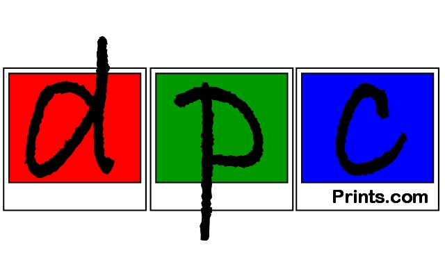
Excellent! Simple, colorful, memorable! Good luck! 10
|
|
|
|
05/06/2003 03:45:40 PM |
| This just doesn't explain enough for me. |
|
|
|
05/06/2003 09:49:12 AM |
| althoug I like the composition and graphic desing I think 'prints.com' is a bit confusing for people not familiar with dpcprints.com |
|
|
|
05/06/2003 12:51:15 AM |
| Nice design. The url is not represented as required. |
|
|
|
05/05/2003 06:49:12 PM |
| the colors catch your attention but that is about it, doesn't really say much about dpcprints |
|
|
|
05/04/2003 11:20:12 AM |
| If I didn't know what this was talking about, I'd surf to prints.com |
|
|
|
05/03/2003 07:51:28 PM |
| I think it's too subtle for people who don't already know what it is... |
|
|
|
05/01/2003 08:51:03 PM |
| The winner as far as I am concerned. |
|
|
|
05/01/2003 03:50:20 PM |
|
|
|
05/01/2003 02:18:36 PM |
Simple and clean design. Not keen on choice of colours or font. Three shades of blue would work better for me and a different font.
5, Kavey |
|
|
|
05/01/2003 11:26:54 AM |
| Maybe it's just me, but I dont associate the 'dpc' as part of the URL. If I was to see this I would think it was advertising //www.prints.com |
|
|
|
05/01/2003 08:43:27 AM |
| Nice design work, but does it tell someone who's never seen it what DPC Pritns is? |
|
Home -
Challenges -
Community -
League -
Photos -
Cameras -
Lenses -
Learn -
Help -
Terms of Use -
Privacy -
Top ^
DPChallenge, and website content and design, Copyright © 2001-2025 Challenging Technologies, LLC.
All digital photo copyrights belong to the photographers and may not be used without permission.
Current Server Time: 03/13/2025 02:50:53 AM EDT.