| Author | Thread |
Comments Made During the Challenge  |
|
|
05/30/2002 07:54:00 PM |
|
|
|
05/30/2002 07:02:00 PM |
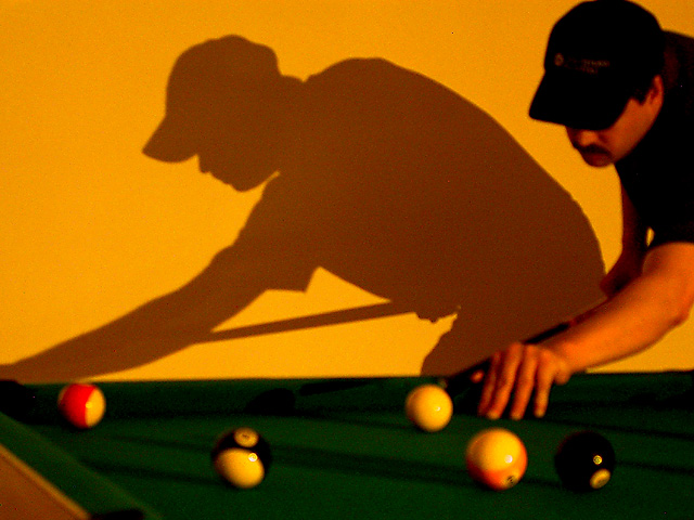
| Neat shadow. I think you did need this yellow lighting, though it takes a bit of adjustment to realize it's OK that those balls aren't white. I think the composition is just about perfect. |
|
|
|
05/30/2002 01:18:00 AM |
|
|
|
05/29/2002 05:06:00 PM |
|
|
|
05/29/2002 03:40:00 PM |
|
|
|
05/29/2002 02:36:00 PM |
|
|
|
05/29/2002 05:21:00 AM |
| Very interesting. I like the use of the shadow here. Colour and image quality don't seem quite right here. I think I would have preferred the focus on the actual player, maybe his hand |
|
|
|
05/29/2002 03:13:00 AM |
| I like the use of the shadow here. |
|
|
|
05/28/2002 11:37:00 PM |
| I like your subject matter, but find your picture slightly out of focus and noisy. |
|
|
|
05/29/2002 12:05:00 PM |
| If you meant to have a yellow tint, it does show the shadow effectively, but it makes the guy look a little jaundiced. Maybe a white balance problem? I like the setup |
|
|
|
05/28/2002 10:03:00 PM |
could have been a great picture. a bit blurry and out of focus and too much orange tint. i do like the shadow on the wall but could have been better.
|
|
|
|
05/28/2002 06:59:00 PM |
| Too blurry. Is the shadow your subject? Don't know if I like that idea for this challenge. |
|
|
|
05/28/2002 05:30:00 PM |
| Seems blurred and out of focus .... |
|
|
|
05/28/2002 04:57:00 PM |
Focus is on the shadow, very cool! Too bad you could get both the subject and the shadow in focus together. I am having a hard time scoring this one fairly. It's just too cool!!!
Photo 9 (don't ask, I want the impossible) Creativity 10 (+++) People 9 total 9 |
|
|
|
05/28/2002 03:13:00 PM |
| Good angle and good composition. I like the shadow, but wish there were a bit more focus on the subject and a little better white balance. |
|
|
|
05/28/2002 12:34:00 PM |
|
|
|
05/28/2002 12:01:00 PM |
| would maybe be even improved with just the shadow, and not the real person in the shot ? |
|
|
|
05/28/2002 11:10:00 AM |
"minnesota skinny"...LMAO!!!
A little blurry. Looks like you took this photo with the flash off and no tripod.
Not sure if you wanted that yellow tinge to the whole picture. If not, you might want to turn on your white balance.
Did you move that background right up against the pool table for this shot?
|
|
|
|
05/27/2002 10:18:00 PM |
|
|
|
05/27/2002 09:01:00 PM |
| This is a nice photo but I would like it better with more focus on the pool balls.. the blur is a little distracting... |
|
|
|
05/27/2002 08:47:00 PM |
| Would have been perfect IMO with just the shadow, moved back a little to be better aimed at the the cue ball, which is moved nearer the corner, and not have the actual person in the picture at all.. and I think this would be within the parameters of the challenge. Try this one again, I think you're on to something |
|
|
|
05/27/2002 06:44:00 PM |
| Little OOF here, but I do like your composition. Well done. |
|
|
|
05/27/2002 12:31:00 PM |
| Neat idea--needs to be more in focus. |
|
|
|
05/27/2002 09:57:00 AM |
|
|
|
05/27/2002 09:12:00 AM |
| everything but the shadow is out of focus.. on purpose? |
|
|
|
05/27/2002 08:35:00 AM |
| Nice crisp shadow. Foreground is kind of confusing because it looks like there is no table edge. |
|
|
|
05/27/2002 07:10:00 AM |
| i like the lighting, just the perfect balance between the man and his shadow |
|
|
|
05/27/2002 06:08:00 AM |
| I love this photo, but I wish the man had been in focus a little more. |
|
|
|
05/27/2002 01:50:00 AM |
| Really like the creativity of this shot, unfortunately it wasn't very well technically executed. Too grainy and focus doesn't seem right. |
|
|
|
05/27/2002 01:26:00 AM |
|
Home -
Challenges -
Community -
League -
Photos -
Cameras -
Lenses -
Learn -
Help -
Terms of Use -
Privacy -
Top ^
DPChallenge, and website content and design, Copyright © 2001-2025 Challenging Technologies, LLC.
All digital photo copyrights belong to the photographers and may not be used without permission.
Current Server Time: 03/12/2025 01:55:34 PM EDT.