| Author | Thread |
Comments Made During the Challenge  |
|
|
07/02/2005 12:23:40 PM |
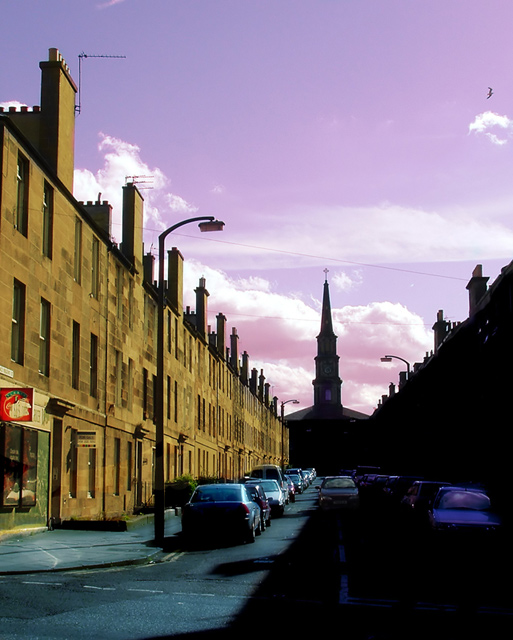
| I'm not sure that I really like the colour of the sky here, it looks a little unnatural to me. I do like the composition, however. |
|
 Photographer found comment helpful. Photographer found comment helpful. |
|
|
07/01/2005 12:11:57 PM |
| The purpel sky is a bit of:( |
|
| Photographer found comment helpful. |
|
|
06/30/2005 04:04:34 PM |
| great title. I'm not sure about the colors in the photo though. I'm assuming they're maniuplated (correct me if I'm wrong), but i don't think it's justified, the kind of thing i try when i'm trying to save a bad photo. but i think your photo is good enough to stand without a purple sky. but that's just one person's preference. 7 |
|
| Photographer found comment helpful. |
|
|
06/30/2005 01:40:05 AM |
| This looks artificial to me. I find the right side of the street too dark. The contrast between the two takes away from your well chosen lines. |
|
| Photographer found comment helpful. |
|
|
06/29/2005 12:23:59 PM |
| great color, and interest.good luck |
|
| Photographer found comment helpful. |
|
|
06/28/2005 10:52:06 PM |
| I like this, although the sky is slightly over exposed. |
|
| Photographer found comment helpful. |
|
|
06/28/2005 04:22:52 PM |
| Scotland? Nice idea but I think there should be just a little shadow detail to balance the highlights. As this is an advanced challenge you can use dodging judiciously and it would lift this shot into a different league |
|
| Photographer found comment helpful. |
|
|
06/27/2005 03:43:06 PM |
| The sky is beautiful, but the power lines and the parked cars kind of distract. |
|
| Photographer found comment helpful. |
|
|
06/27/2005 02:00:31 PM |
| i'm liking your composition. i would have gone with stronger contrast. possibly blackening everything on the right except the car in the middle. i realize you would lose the street line but i think it just competes with the shadow line anyway. now you have this light vs dark, good vs evil thing working with the church. |
|
| Photographer found comment helpful. |
|
|
06/27/2005 09:41:05 AM |
|
| Photographer found comment helpful. |
|
|
06/27/2005 07:40:46 AM |
| I like the composition very much. The leading lines are several, and meaningful. There is something about the processing that I feel detracts, however ... the colour of the sky and the harshness of the contrast (both of which I assume were intentional) rob the image of some of its potential impact. They get in the way, is what I mean. So does the bird. Still, it's a fine Leading Lines composition. 7 |
|
| Photographer found comment helpful. |
|
|
06/27/2005 12:40:11 AM |
| This is really good except for the purple sky. |
|
| Photographer found comment helpful. |
Home -
Challenges -
Community -
League -
Photos -
Cameras -
Lenses -
Learn -
Help -
Terms of Use -
Privacy -
Top ^
DPChallenge, and website content and design, Copyright © 2001-2025 Challenging Technologies, LLC.
All digital photo copyrights belong to the photographers and may not be used without permission.
Current Server Time: 03/12/2025 09:52:32 AM EDT.