| Author | Thread |
Comments Made During the Challenge  |
|
|
05/04/2003 10:54:40 PM |
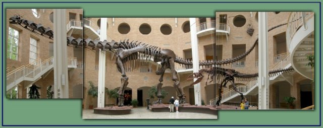
| Good use of the challenge. I don't think you could appreciate the size as much if it was crammed into one frame. The people standing next to it also work to show it's size. |
|
 Photographer found comment helpful. Photographer found comment helpful. |
|
|
05/04/2003 05:25:35 PM |
| excellent theme for a triptych :) I think the background color should be more representative somehow... |
|
| Photographer found comment helpful. |
|
|
05/04/2003 03:24:11 AM |
| The people (and staircases) provide a sense of scale that makes this shot immensely more effective. This shot made me think about how I can't even imagine a living one of those suckers. |
|
| Photographer found comment helpful. |
|
|
05/02/2003 06:37:06 PM |
| Really neat series! It matched up pretty well with the outer panels at an angle, but not with the building (I think these angled cells add more interest, even if they don't match up exactly, but a perfect shot would have matched it all using a tripod with a flex head. 9 Rob the Swash (and anthropologist!) |
|
| Photographer found comment helpful. |
|
|
05/01/2003 07:41:39 PM |
| very appropriate ... three images makes it look huge. Good capture. Jacko. 9 |
|
| Photographer found comment helpful. |
|
|
04/30/2003 10:53:18 PM |
| Nice composition. It is little difficult to see since the images are so small and there is so much in the image. I wish we could use 800 wide for this challenge! |
|
| Photographer found comment helpful. |
|
|
04/30/2003 08:34:19 PM |
|
| Photographer found comment helpful. |
|
|
04/30/2003 06:33:13 PM |
| I like it. Good use of drop shadow. |
|
| Photographer found comment helpful. |
|
|
04/30/2003 03:15:59 PM |
| Apart from the unnecessary drop shadows and outer frame (why frame frames) this makes a really nice set of pictures. 8 |
|
| Photographer found comment helpful. |
|
|
04/30/2003 01:07:40 PM |
| Wow! Your use of three panels to fit these guys into the frame was great! The divisions between the photos really helps to accentuate the SIZE of these beasts. I like your choice of the soft green for the background, too. Impressive. |
|
| Photographer found comment helpful. |
|
|
04/30/2003 12:08:33 PM |
| very nice. very fun. i'm not sure if i like the choice of green as a background, but clearly that means i can't find any fault with the photos. |
|
| Photographer found comment helpful. |
|
|
04/29/2003 12:26:50 PM |
|
| Photographer found comment helpful. |
|
|
04/29/2003 01:55:53 AM |
| This looks as though it was fun. 8 |
|
| Photographer found comment helpful. |
|
|
04/29/2003 12:30:34 AM |
| I like the green background, it fits well with the other colors of the shots. |
|
| Photographer found comment helpful. |
|
|
04/28/2003 07:27:56 PM |
| Bery nice work and I love the discontinuities remind me of some escher works. 9 |
|
| Photographer found comment helpful. |
|
|
04/28/2003 12:56:12 PM |
| I wish these skeletons could be in a larger format so I could see them clearly. Really fun idea, giving the skeleton the symbolic appearance of longer length. |
|
| Photographer found comment helpful. |
|
|
04/28/2003 09:20:44 AM |
| excellent use of the triptych to stitch this panorama together and show much more than you normally could of this fine specimen! 10. |
|
| Photographer found comment helpful. |
Home -
Challenges -
Community -
League -
Photos -
Cameras -
Lenses -
Learn -
Help -
Terms of Use -
Privacy -
Top ^
DPChallenge, and website content and design, Copyright © 2001-2025 Challenging Technologies, LLC.
All digital photo copyrights belong to the photographers and may not be used without permission.
Current Server Time: 03/12/2025 11:58:08 PM EDT.