| Author | Thread |
Comments Made During the Challenge  |
|
|
07/03/2005 06:12:23 PM |
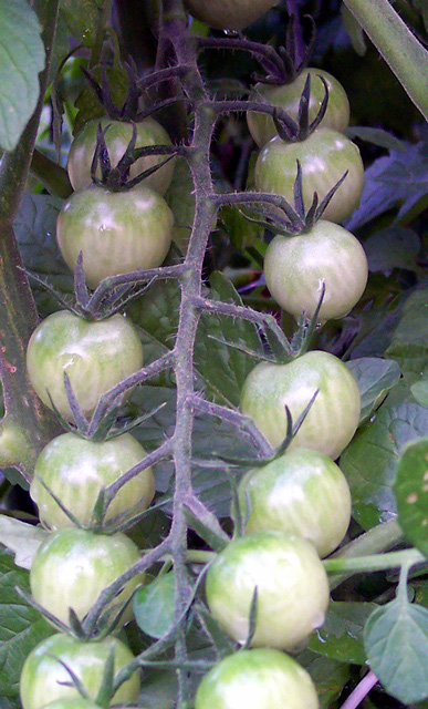
| This might benefit from either more saturation, or a convergence to b/w. though the tomatos are similar in tone to the leaves, so maybe b/w might noy be so flattering.Cropping off the blurrier tomatos at the bottom might help too. |
|
 Photographer found comment helpful. Photographer found comment helpful. |
|
|
07/02/2005 11:10:17 PM |
| Very nice .. purple is a tough color to capture. |
|
| Photographer found comment helpful. |
|
|
07/02/2005 04:36:19 PM |
| terrific lines, nice design, the tomatoes are a funny color |
|
| Photographer found comment helpful. |
|
|
07/02/2005 12:49:11 PM |
| I feel that this image is let down, to an extent, by the comparative softness of the tomatoes at the bottom of the frame. |
|
| Photographer found comment helpful. |
|
|
07/02/2005 07:35:50 AM |
| This photo uses lines as a strong compositional element, but I'm not feeling that the lines are leading my eye, really. I suppose that there are lines leading to each tomato, though. |
|
| Photographer found comment helpful. |
|
|
06/28/2005 05:56:08 PM |
Leading lines or curves generally have two purposes. One is to lead the viewer into the scene. The other is to lead you toward the main subject. It is most effective if they come in from the lower left because that is the natural direction humans visually scan a picture so easiest to pick up.
An curious twist on the concept of leading lines. |
|
| Photographer found comment helpful. |
Home -
Challenges -
Community -
League -
Photos -
Cameras -
Lenses -
Learn -
Help -
Terms of Use -
Privacy -
Top ^
DPChallenge, and website content and design, Copyright © 2001-2025 Challenging Technologies, LLC.
All digital photo copyrights belong to the photographers and may not be used without permission.
Current Server Time: 03/16/2025 07:29:24 PM EDT.