DPChallenge: A Digital Photography Contest You are not logged in. (log in or register
 
Challenge Entries
Portfolio Images
This image is not part of a public portfolio.
 Little Stone Brige
Little Stone Brige
khdoss


Photograph Information Photographer's Comments
Challenge: Leading Lines II (Advanced Editing IV)
Camera: Nikon D70
Lens: Nikon AF Zoom-Nikkor 28-200mm f/3.5-5.6G IF-ED
Location: Aldie Virginia
Date: Jun 25, 2005
Aperture: f/22
ISO: 200
Shutter: 1/40s
Galleries: Landscape, Rural
Date Uploaded: Jun 26, 2005

Great little side road in Aldie, full of twists and turns.

curves
levels
hues and saturation
removed a sign and car

Statistics
Place: 190 out of 275
Avg (all users): 5.0496
Avg (commenters): 5.4286
Avg (participants): 4.8629
Avg (non-participants): 5.2458
Views since voting: 939
Views during voting: 301
Votes: 242
Comments: 8
Favorites: 0


Please log in or register to add your comments!

AuthorThread
07/04/2005 02:04:50 AM
Hi Karen,

In keeping with what I was suggesting during the challenge, here is an edit I did:


-----------Original-------------Edited------------

Open each thumbnail and switch between them in the taskbar.

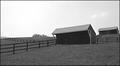
Adjustments were all basic, using Photoshop 7.0 (I'm at home - CS2 at work)
* Image, rotation, arbitrary, 0.3 degrees CCW.
* Levels, Options, default 0.5 & 0.5
* Brought down brightness & brought up contrast a little.
* Hue/Saturation, Yellow, Hue to the right a little, saturation to the right a little and brighness down a bit.
* Hue/Saturation, Green, saturation up a bit, brightness down
* Image, Adjustments, slective, Yellow & Green, bottom slider, and increased black levels a little.
* Image, Mode, Labcolor, Brightness channel, Unsharp mask 50, 0.3, 0
repeat USM again, Image, mode RGB.
* Redid framing as close as I could to match yours.

This is just a real quick 3-4 minute edit just for comparison sake.

 Comments Made During the Challenge
07/03/2005 11:26:59 PM
Nice & serene composition.
Suggestion to better this:
1) Though it may be horizontally correct, the landscape makes it seem off. Perhaps a minor CCW rotation would ease the eye a little.
2) Bring the darkness down a little, and the contrast up a little to give it a little more punch.
3) In your software, try this: Take the Hue of the yellow channel and tweak it a little to the green side, up the saturation and bring down the darkness of the same. This will shift the yellowish cast to a darker green, making the image richer in appearance.
After the challenge, feel free to contact me and I can show you how to take the great potential in a shot like this and really make it come alive.

Message edited by author 2005-07-04 03:27:20.
07/03/2005 02:50:42 AM
This is very pretty and the leading road is good. It would probably be a bit more impressive if the saturation and contrast was increased. Good pic.
  Photographer found comment helpful.
07/02/2005 11:22:10 PM
Lighting is too washed out
  Photographer found comment helpful.
07/02/2005 03:01:01 AM
I like the line leading up and through the frame, although I feel that a bit more contrast and sharpening would make this 'pop' a bit more.
  Photographer found comment helpful.
07/01/2005 10:54:28 PM
looks so peaceful here
  Photographer found comment helpful.
07/01/2005 07:42:50 PM
Looks to me to be overexposed. I would have liked more color in the color. The image just appears to me as flat . I like the view. Try it again.
  Photographer found comment helpful.
06/27/2005 08:55:28 AM
pretty picture
  Photographer found comment helpful.


Home - Challenges - Community - League - Photos - Cameras - Lenses - Learn - Help - Terms of Use - Privacy - Top ^
DPChallenge, and website content and design, Copyright © 2001-2025 Challenging Technologies, LLC.
All digital photo copyrights belong to the photographers and may not be used without permission.
Current Server Time: 03/16/2025 11:12:02 AM EDT.