| Author | Thread |
|
|
05/08/2003 12:27:01 AM |
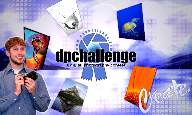
Basically, you're all right about the photographer - though it looked good in my mind, it didn't turn out so well in the design, and I should've recognized that. It is significantly improved as an abstract design without the inclusion of the photographer (and I assure you, I'm not generally that "droll" and this is certainly the first time I've earned the dubious distinction of "goose").
Thanks for all of your comments.
|
|
Comments Made During the Challenge  |
|
|
05/07/2003 04:47:39 PM |
| No offense, but I think having a person in it takes away from it. |
|
|
|
05/05/2003 11:55:56 AM |
| Nice concept, would have been better without the inclusion of the photographer. Sorry if that's you ;-) |
|
|
|
05/04/2003 01:23:42 PM |
| too busy...i just like the create fonts... |
|
|
|
05/04/2003 05:50:07 AM |
| a little too colourful for my taste |
|
|
|
05/02/2003 08:20:58 PM |
| The guy with camera seems a little out of place, and the look on his face is a little overdone. Perhaps if the circle of pictures were shifted a little to the right it would make the design a little more balanced as well. Also, each of those individual pictures would be very small on a 3x5 sticker. Dispite all that, this is a very well done design that effectively conveys the appeal of the site, and would do a good job of attracting interest I think. 8 |
|
|
|
05/02/2003 01:26:03 PM |
| This is very nicely done - very creative looking, and the expression on the guy's face conveys "fun atmosphere". |
|
|
|
05/02/2003 10:52:31 AM |
| I saw this and said - Aaah wow! Nice I like it. One of my favorites. 10. |
|
|
|
05/01/2003 11:34:54 PM |
| Sorry, but with that expression the guy looks like a goose. Perhaps if he was more inthe background in the act of photographing the scene. |
|
|
|
05/01/2003 11:26:56 PM |
| Pretty nice background. But the URL is a little too small. Needs to stick out a lot more. |
|
|
|
05/01/2003 09:22:37 PM |
| This is great. Except for the expression on the guys face, made me laugh, he's a bit TOO happy IMO. :) :) :) :) |
|
|
|
05/01/2003 02:21:19 PM |
| hmmm... nice jellyfish :) I really like the background... I'm not sure that the photos are large enough on this size sticker to really work though. |
|
|
|
05/01/2003 12:23:04 PM |
Too busy and too detailed for a sticker, IMO.
Feels rather chaotic.
Sorry!
4, Kavey |
|
|
|
05/01/2003 11:53:32 AM |
| Nice job with this one.... |
|
|
|
05/01/2003 11:41:51 AM |
| Droll image of photographer, but sticker would be improved without it. |
|
|
|
05/01/2003 08:44:49 AM |
|
|
|
05/01/2003 12:46:47 AM |
| Nicely done! Very well thought out design. Once of my three favs. (and its not just because it has one of my images in it!) |
|
Home -
Challenges -
Community -
League -
Photos -
Cameras -
Lenses -
Learn -
Help -
Terms of Use -
Privacy -
Top ^
DPChallenge, and website content and design, Copyright © 2001-2025 Challenging Technologies, LLC.
All digital photo copyrights belong to the photographers and may not be used without permission.
Current Server Time: 03/12/2025 10:17:41 AM EDT.