| Author | Thread |
Comments Made During the Challenge  |
|
|
05/03/2003 07:10:48 AM |
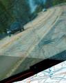
| Nice concept, however there seems to be too many competing elements here, ie. the black barrs on top,the thing in the bottom right, and the reflection. I love the colour though. |
|
 Photographer found comment helpful. Photographer found comment helpful. |
|
|
05/02/2003 07:20:23 AM |
| I think you can see your outline in the reflection, which detracts somewhat from the shot. I find the various bits and pieces a bit distracting in the shot, but I like the dominant red colour. |
|
| Photographer found comment helpful. |
|
|
04/30/2003 05:04:58 PM |
| I find the light here a bit too glary. A polarizer might have helped. |
|
| Photographer found comment helpful. |
|
|
04/30/2003 02:31:44 PM |
| Obviously the US-typeface of Volkswagen. I like the european one better! - I'm not impressed with machinery in this challenge, a lot of it about... - 5 |
|
| Photographer found comment helpful. |
|
|
04/30/2003 11:38:46 AM |
| Nice almost abstract. Suggests the brand's playfulness. |
|
| Photographer found comment helpful. |
|
|
04/30/2003 03:29:52 AM |
| Love the old volkswagens. |
|
| Photographer found comment helpful. |
Home -
Challenges -
Community -
League -
Photos -
Cameras -
Lenses -
Learn -
Help -
Terms of Use -
Privacy -
Top ^
DPChallenge, and website content and design, Copyright © 2001-2025 Challenging Technologies, LLC.
All digital photo copyrights belong to the photographers and may not be used without permission.
Current Server Time: 03/13/2025 04:09:55 PM EDT.