| Author | Thread |
|
|
07/06/2005 12:17:49 AM |
| Ancient. Congratulations on your top 20 finish. |
|
Comments Made During the Challenge  |
|
|
07/05/2005 09:30:28 PM |
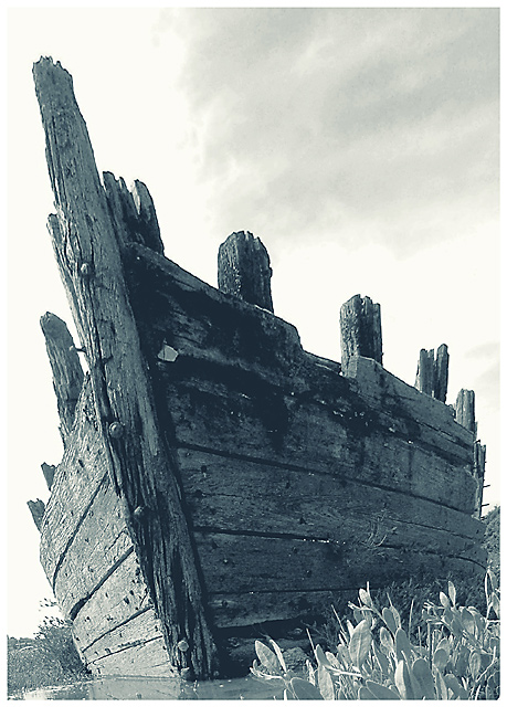
| Nice compostion...not sure about the colour |
|
|
|
07/05/2005 08:55:28 PM |
| Nice duotone shot..perhaps a little more contrast, but it still is great as high key image. |
|
|
|
07/05/2005 03:55:11 PM |
| Seems a little bit over exposed but what a great shot, one of my favs! 7 |
|
|
|
07/05/2005 12:12:30 PM |
|
|
|
07/05/2005 10:54:51 AM |
| BW works well for this. I don't have a recommendation. Seems like something is needed to improve the impact. |
|
|
|
07/05/2005 12:33:55 AM |
| Nice~!! I like the color of this mood~! Really obsolete feel.. |
|
|
|
07/04/2005 12:56:05 PM |
| Excellent composition ... I would have liked to see deeper colors and a little stronger contrast to me the picture appeared washed out. |
|
|
|
07/04/2005 07:14:40 AM |
| Nice! maybe better with different colors |
|
|
|
07/03/2005 01:01:22 PM |
I love the perspective of this shot, and what a great subject for this theme. Neat texture. 7
|
|
|
|
07/03/2005 07:15:43 AM |
Very nice image! The only thing maybe...just a bit more contrast...
Love the textures! :) |
|
|
|
07/02/2005 03:45:47 PM |
| wow, that's a great picture, love the tones on it |
|
|
|
07/02/2005 01:14:38 PM |
| one of the best shots to fit the theme. |
|
|
|
07/02/2005 06:36:43 AM |
| great pic, love the monochrome you used. |
|
|
|
06/30/2005 06:34:33 PM |
| I like this shot. I would have liked it better with more deep b&w but that's my preference. |
|
|
|
06/30/2005 10:31:03 AM |
| Good angle, more sharpness needed |
|
|
|
06/30/2005 09:14:52 AM |
| really nice composition and subject... not sure about the choice of duotone, but i like it |
|
|
|
06/30/2005 06:11:59 AM |
| I recognise that old boat :) Good angle. |
|
|
|
06/29/2005 09:47:21 PM |
| like the image as is but I also wish there was a little more space around it to give me a sense of place. Excellent job keeping the detail in conversion to black and white. Love the tones. 8 from me - good luck in the challenge! |
|
|
|
06/29/2005 05:11:02 PM |
| I really like the angle from which this picture was shot. I'm not so sure I like the washed out look. Appears to be too much light. Perhaps early morning or evening would be a better time to take this with the sun to your back. |
|
|
|
06/29/2005 04:36:27 PM |
|
|
|
06/29/2005 04:18:12 PM |
| Needs a bit more contrast for that 'zing', well composed however, overall nice shot. |
|
|
|
06/29/2005 10:29:01 AM |
| seems a little washed out, a darker approach may have been in order when doing the post processing. Great image though. |
|
|
|
06/29/2005 10:17:07 AM |
| The ark?? Interesting perspective. |
|
Home -
Challenges -
Community -
League -
Photos -
Cameras -
Lenses -
Learn -
Help -
Terms of Use -
Privacy -
Top ^
DPChallenge, and website content and design, Copyright © 2001-2025 Challenging Technologies, LLC.
All digital photo copyrights belong to the photographers and may not be used without permission.
Current Server Time: 03/11/2025 12:55:09 PM EDT.