| Author | Thread |
Comments Made During the Challenge  |
|
|
05/04/2003 11:40:39 PM |
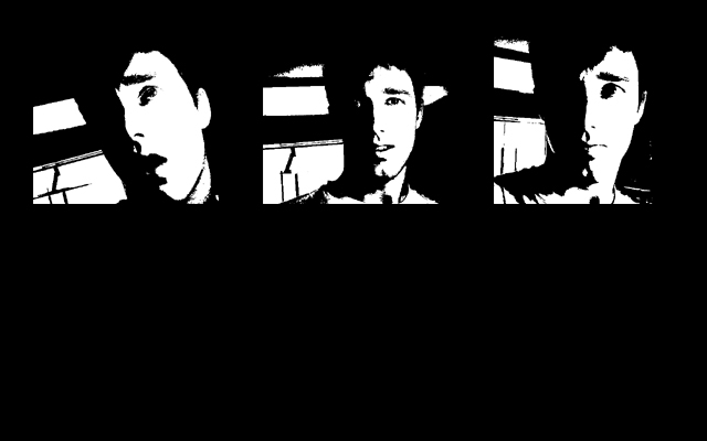
| looks like digital art and not photography |
|
 Photographer found comment helpful. Photographer found comment helpful. |
|
|
05/04/2003 06:40:05 PM |
| I'm really not sure why there's all that black space at the bottom, but a tighter frame would definately help here. I like the middle shot, because the captured expression seems the most authentic, and it seems to be the most genuine representation of the person (who I'm guessing is you). Maybe instead of different expressions this could have been done with different zooms or angles instead. I do like the extreme contrast effect, and how you worked the background into it. The abstract result works well. 7 (mostly for the center frame) |
|
| Photographer found comment helpful. |
|
|
05/04/2003 05:27:28 PM |
A littel more black space on the top would have helped!
Zoom out image one a littel bit, that may bring in more harmony as the amount of white has increased in image three.
It makes me think! I like it.. |
|
| Photographer found comment helpful. |
|
|
05/01/2003 02:17:32 PM |
| It's a good series. The effect used here works, but makes the photos too far removed from photography for my tastes. I also have mixed feelings about the large "negative" space at the bottom. 7 Rob the Swash |
|
| Photographer found comment helpful. |
|
|
04/29/2003 12:46:34 PM |
| I like the use of extreme contrast and the empty space - it kind of reads "more to follow", as if it is an incomplete story. Good work. |
|
| Photographer found comment helpful. |
|
|
04/28/2003 06:13:53 PM |
Very nice! The big black space at the bottom brings is together very well. Although this is more a "poster" than a photo tryptich. ~7
Message edited by author 2003-05-05 08:52:04. |
|
| Photographer found comment helpful. |
|
|
04/28/2003 05:10:29 PM |
| i like the comic style fx. very cool in b&w. it would've been great to have some kinf of story or something like that. |
|
| Photographer found comment helpful. |
|
|
04/28/2003 02:38:40 PM |
| Nice picture its inspired me to do some experimenting |
|
| Photographer found comment helpful. |
|
|
04/28/2003 10:55:08 AM |
| The black & white images are nice, but there is too much empty space in the bottom half of the picture. Nice idea though. |
|
| Photographer found comment helpful. |
|
|
04/28/2003 10:16:40 AM |
| Very cool - I love the comic book look. Very well done. |
|
| Photographer found comment helpful. |
Home -
Challenges -
Community -
League -
Photos -
Cameras -
Lenses -
Learn -
Help -
Terms of Use -
Privacy -
Top ^
DPChallenge, and website content and design, Copyright © 2001-2025 Challenging Technologies, LLC.
All digital photo copyrights belong to the photographers and may not be used without permission.
Current Server Time: 03/12/2025 09:44:30 PM EDT.