| Author | Thread |
|
|
05/07/2003 08:48:17 AM |
*Critique Club*
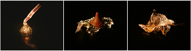
FIRST IMPRESSION: Great shot, worthy of printing and hanging!
CHALLENGE: Meets the challenge.
COMPOSITION: Excellent, consistent composition. My only nit is that the reflection in the first frame is not echoed in the other two. It also seems odd that your first shot is from slightly above the subject while the other two are more straight on. This inconsistency may have bothered the voters.
TECHNICAL: Exposure, lighting and color are flawless.
CONCLUSION: Great shot, and one I might expect to see hanging in a candy shop or for sale in Hershey. I'm frankly surprised this did not score higher than it did.
Thanks for sharing and good luck in future challenges!
Message edited by author 2003-05-07 10:43:23. |
|
 Photographer found comment helpful. Photographer found comment helpful. |
Comments Made During the Challenge  |
|
|
05/04/2003 07:55:26 PM |
| Very nice composition, tells the life of a Hershey Kiss. |
|
| Photographer found comment helpful. |
|
|
05/04/2003 07:46:25 PM |
| great concept. Would like to see the kiss fill the frame a bit more. presentation is good, but would be boosted with a bit more graphic framing/matting. nice job all around. |
|
| Photographer found comment helpful. |
|
|
05/03/2003 12:46:21 PM |
Nice Idea. Overall a bit dark. I like the reflection on the first one, but would like to see it on the rest too
|
|
| Photographer found comment helpful. |
|
|
04/29/2003 06:39:42 PM |
| needs the black level adjusted some so that it matches on all 3 but it's a cute idea |
|
| Photographer found comment helpful. |
|
|
04/28/2003 08:49:25 PM |
|
| Photographer found comment helpful. |
|
|
04/28/2003 05:24:01 PM |
| I like the idea of the sequence, but I think you should have left the wrapper at the bottom of the second and third frame. The way it is now, it looks like the wrapper is floating away and because of that, the illusion of the eaten chocolate is not so strong anymore. |
|
| Photographer found comment helpful. |
|
|
04/28/2003 12:33:34 PM |
| Good storytelling progression here. Nice tones and lighting, too. Composition is wonderful. 9 |
|
| Photographer found comment helpful. |
|
|
04/28/2003 12:04:13 PM |
tighter crops on each image would have been better
|
|
| Photographer found comment helpful. |
|
|
04/28/2003 11:09:44 AM |
|
|
|
04/28/2003 09:23:46 AM |
| wish the blacks were the same |
|
| Photographer found comment helpful. |
|
|
04/28/2003 01:50:45 AM |
| Left panel seems a bit lighter than the other two...otherwise good idea and composition. |
|
| Photographer found comment helpful. |
|
|
04/28/2003 01:25:06 AM |
| LOL! Been hanging out at my house??? This is very cute! The light is a little "yellow", but still great shots! |
|
| Photographer found comment helpful. |
|
|
04/28/2003 12:55:31 AM |
| I like the colours. Image could be larger, but I suppose you'll hear alot of that. Don't worry about it. |
|
| Photographer found comment helpful. |
|
|
04/28/2003 12:29:45 AM |
| It would be really good, except the backgruond isnt the same hue in all three images |
|
| Photographer found comment helpful. |
Home -
Challenges -
Community -
League -
Photos -
Cameras -
Lenses -
Learn -
Help -
Terms of Use -
Privacy -
Top ^
DPChallenge, and website content and design, Copyright © 2001-2025 Challenging Technologies, LLC.
All digital photo copyrights belong to the photographers and may not be used without permission.
Current Server Time: 04/28/2025 09:32:28 AM EDT.