A more shallow DOF is suggested to have less detail on the background. Also, if you underexposed it a bit, I guess the face would be more dramatic. Why not a plain black background? For me, I bought a black velvet cloth for that purpose.
For the pose, I would suggest a more tighter crop on the left. But then, you don't like to crop out the hand, do you? So maybe let him move his hand higher close to his ear. I am glad the other hand is not shown as this portrait is better off asymmetrically.
If this is posted in a comepetition and granted that it suits the theme, I would give it a 7. It means that it is an above average portrait.
I really like his pose....he looks comfortable, relaxed, yet is directly looking towards the camera. Get a real sense of his personality, good humour from this shot.
Well done in making your model feel relaxed enough to get this sort of pose. Lighting, dof and colours are great. Agree with Kevin about the line in the drapes, it draws the eye.
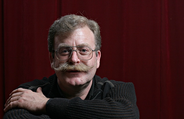
I like the gradual slide in tones across the background but this has a few little things that aren't bad but just some things you could consider. The subject stands out from his direct background just fine. Great job on that part. I see a vertical line of light farther to the image right, just beside the seam of the backdrop. This seems just a little contentious and I think you could easily burn that or heal it out of the shot along with the seam and just see how much of a difference it makes. On the subject's face, I love the definition you captured here. The mustache and hairline really create some character that looks fun to work with. Under the subject's eyes, however, I see darkness with strong edges. I think I'd at least try a version of this where those dark edges were healed with a soft-medium edged healing brush. It wouldn't totally remove the dark areas (which I feel add some character) but it might keep them from being so prominent. I think this is added to since the catchlights are relatively small in the subject's eyes (and I'm sure that's a function of you trying to keep the glare out of the glasses). The one thing I notice that you can't go back in processing to work on is the hand. Its fine that he has one hand up and (I presume) the other hand down. It does invite the viewer to consider whether he lost his hand and how. Neat if what you wanted was to intrigue your viewers. If, on the other hand (please pardon the pun), what you wanted was a good representation of the subject for family or professional work then I would think that keeping the viewer drawn up to that face with al its texture and lines and hairy hair hair, you might just have wanted a little of the subject's right hand to appear so that the viewer "felt" the symmetry without having to look down and wonder about the hand. Not a major issue; you've covered the major point of the subject by capturing his face well; maybe its just something to consider next time you look through the lens for a shot like this.
Oh yeah. I like your compositional idea here to move him off to the side. Were it me, I might have cropped the image a little taller to get his face closer to teh intersection of the top and left thirds lines but I'm afraid that such a cropping would lose the impact of having that face so prominently displayed. That's the trade off you have to try and then decide what you like. All-in-all, I like how you composed/cropped this shot, though.