| Author | Thread |
Comments Made During the Challenge  |
|
|
07/12/2005 05:47:57 PM |
| I really like the simplilcity of this. Nice shot. |
|
 Photographer found comment helpful. Photographer found comment helpful. |
|
|
07/12/2005 05:09:49 PM |
| Different prespective. Color combination is good. |
|
| Photographer found comment helpful. |
|
|
07/12/2005 12:34:21 PM |
|
|
|
07/10/2005 08:21:22 AM |
| Good composition, good capture. Very pleasing to my eye. |
|
| Photographer found comment helpful. |
|
|
07/08/2005 07:35:59 PM |
| Very similar shot in the last competition I thought that one was stronger because the took it with the light on and the room dark. |
|
| Photographer found comment helpful. |
|
|
07/08/2005 01:02:26 PM |
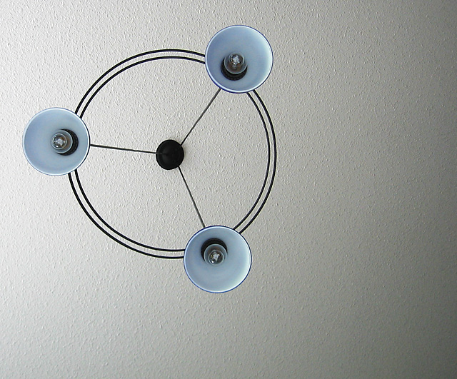
| i like the off-center composition. very abstract. too bad the ceiling is textured. |
|
| Photographer found comment helpful. |
|
|
07/08/2005 07:48:04 AM |
| it could have been better centered! |
|
| Photographer found comment helpful. |
|
|
07/08/2005 02:14:32 AM |
| Great shot - did you try it with the bulbs lit? 8 |
|
| Photographer found comment helpful. |
|
|
07/08/2005 12:28:19 AM |
| ring of light with no light!! funny, but an interesting picture anyway. I don't really care for the light on the left side. 6 |
|
| Photographer found comment helpful. |
|
|
07/07/2005 04:57:02 PM |
| Nice, but i think it is a little too tight and the ceiling should be brighter. |
|
| Photographer found comment helpful. |
|
|
07/06/2005 12:58:01 PM |
| nice composition. unfortunate that you have a chipboard ceiling - as for me, that is a distraction. lighting perhaps a bit flat (though hard to do muchwith that here, I expect). |
|
| Photographer found comment helpful. |
|
|
07/06/2005 09:18:57 AM |
| now that's a nice light shade, also like the fact that it's off centred... |
|
| Photographer found comment helpful. |
|
|
07/06/2005 06:53:38 AM |
| Good one. Not sure, but I guess it would have come better with lights on. 8. |
|
| Photographer found comment helpful. |
|
|
07/06/2005 05:15:29 AM |
| I like it, circles around cirles within circles. That'll do :) |
|
| Photographer found comment helpful. |
|
|
07/06/2005 01:56:47 AM |
| This is my fav of the submissions thus far! I'm not sure I feel about the gradation of light from right to left. I think it would have been a stronger composition with an even amount of light (like what's on the top left) across the entire frame. This photo screams great use of negative space - but they darkness on the right takes away from that negative space, IMO. -9 - JeB |
|
| Photographer found comment helpful. |
Home -
Challenges -
Community -
League -
Photos -
Cameras -
Lenses -
Learn -
Help -
Terms of Use -
Privacy -
Top ^
DPChallenge, and website content and design, Copyright © 2001-2025 Challenging Technologies, LLC.
All digital photo copyrights belong to the photographers and may not be used without permission.
Current Server Time: 03/12/2025 01:40:19 AM EDT.