| Author | Thread |
Comments Made During the Challenge  |
|
|
07/12/2005 02:49:33 PM |
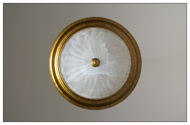
| nice idea, I would suggest cropping it tighter on the sides, perhaps in a square, so you dont have all the dead empty space distracting your eyes, looking for something else. |
|
|
|
07/09/2005 07:40:23 PM |
| If this wasn't so centered it appeal to me personally, more... 6 |
|
 Photographer found comment helpful. Photographer found comment helpful. |
|
|
07/08/2005 12:56:09 PM |
| the composition is too centered and not very interesting. |
|
| Photographer found comment helpful. |
|
|
07/07/2005 04:38:19 PM |
| The lighting makes it look like it's floating. I like it. |
|
| Photographer found comment helpful. |
|
|
07/06/2005 01:43:07 PM |
Fit to challenge criteria: 2 /2
Contrast/Colors: 1/2
Photo Quality: 1/2
Composition: 0/2
My subjective affinity: 0/2
Score: 5 |
|
|
|
07/06/2005 10:58:27 AM |
|
Home -
Challenges -
Community -
League -
Photos -
Cameras -
Lenses -
Learn -
Help -
Terms of Use -
Privacy -
Top ^
DPChallenge, and website content and design, Copyright © 2001-2025 Challenging Technologies, LLC.
All digital photo copyrights belong to the photographers and may not be used without permission.
Current Server Time: 03/12/2025 01:41:32 PM EDT.