| Author | Thread |
|
|
05/10/2003 06:43:18 PM |
~ Critique Club Comment ~
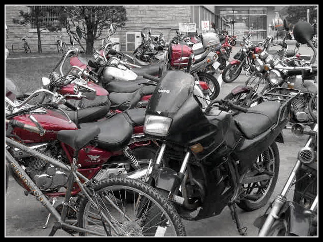
Composition : I found it a little difficult to pick out which was the "odd" one. First glance, I thought it was the black bike in the center. Then I thought the bicycle might be the subject and wondered why the front was cut off. From your comment, I see you weren't happy with it either. The background didn't really add anything for me either.
Exposure / Lighting : There is a good range of tones and nothing is over/under-exposed. The lighting seems to lend a 1950's kind of feel to it.
Focus : The unfortunate quality setting really hurt you. The low-res pixelation makes it look out of focus even though it isn't. But you already know that, so I won't harp on it.
Post Processing : 2 post processes stand out here. The border and the de-saturation. The border was well done and added to the photo. This coming from someone that usually doesn't like borders. It was simple and clean. The de-saturation didn't work as well (to my eye). I think maybe there were too many red objects to make it effective. Also the turn signals had some red in them and the de-saturation left them kind of dirty brown. For me, de-saturation works best when you have one object (the subject) that will remain in color. Here the subject got desaturated. While this might work, I didn't feel it worked for you here.
Challenge / Wow : Certainly on target challenge-wise... It was a little too cluttered and low-res to really carry much Wow.
My opinion : Nice effort, but it suffered from the mistaken settings and lack of attention to composition. |
|
 Photographer found comment helpful. Photographer found comment helpful. |
Comments Made During the Challenge  |
|
|
05/06/2003 02:04:25 PM |
|
|
|
05/04/2003 01:08:16 PM |
heya! ;) I did a similar thing with my photo! I like the idea of this shot, but my two critiques are: its way too busy. there are too many bikes going in too many different directions to really get a feel for what you are trying to convey. Is it the one black motorcycle? Is it the bike? (in which case, we only see the back end of it, like an afterthought).
Also, there is some bit of funny digital pattern effect on some of the bikes and seats, which might just be a results of your post-processing. If you had a more shallow DOF, that might have helped to unclutter the picture and if you pulled back from the bikes more, then I think we'd have it! :) |
|
| Photographer found comment helpful. |
|
|
05/04/2003 08:07:48 AM |
| I like the Idea. Too bad you lost some of the detain when you reduced the file size. |
|
| Photographer found comment helpful. |
|
|
05/03/2003 09:48:44 PM |
| Nice use of saturation, image is a little busy for me though |
|
| Photographer found comment helpful. |
|
|
05/03/2003 01:09:47 AM |
| partical desaturation doesn't work for me here.. |
|
|
|
05/02/2003 10:21:22 PM |
| is the odd one out the bicycle or the black motorcycle? at first i thought it was the bicycle until i realized that the photo had been desaturated except for red. a different angle might have made this more clear and the photo more powerful. |
|
| Photographer found comment helpful. |
|
|
05/02/2003 01:35:36 PM |
| But it isn't an odd *one* out, there's red all over the scene! Besides, the compression artifacts are real problem |
|
| Photographer found comment helpful. |
|
|
05/02/2003 08:25:19 AM |
| Red is a very strong colour and distracts the viewer from the main subject. More impact would have been achieved if the odd one out was the red bike instead of the black one. Another thing to try would be to have the odd one out about 2/3 of the way back and use depth of field to blur the foreground and background. |
|
| Photographer found comment helpful. |
|
|
04/30/2003 09:38:51 PM |
| Good concept but it looks too monochrome for my taste. -6- |
|
|
|
04/30/2003 01:20:29 PM |
Oh this must be the Sony Mavica FD-73 camera. So you must be one of the class of students that have a unique way of leaving identical comments for every photo. I don`t care for that very much but this photo is probaly the best one yet with this rather limited camera.
Good luck. 8 |
|
|
|
04/30/2003 07:25:50 AM |
| the color does not look right, it distracts from this image rather than enhances it. |
|
|
|
04/30/2003 07:12:59 AM |
| Wow, bike salad! Interesting effect desturating all but red. |
|
Home -
Challenges -
Community -
League -
Photos -
Cameras -
Lenses -
Learn -
Help -
Terms of Use -
Privacy -
Top ^
DPChallenge, and website content and design, Copyright © 2001-2025 Challenging Technologies, LLC.
All digital photo copyrights belong to the photographers and may not be used without permission.
Current Server Time: 03/12/2025 10:26:51 AM EDT.