| Author | Thread |
Comments Made During the Challenge  |
|
|
05/03/2003 08:28:12 PM |
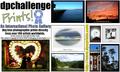
| A similar idea to mine, but a cleaner design. Might have flipped the bison and made the sample photos a touch bigger -- I think there is enough space to do that by spreading the type out without it looking cluttered. Good job! |
|
|
|
05/02/2003 10:37:32 AM |
| Overall, good image. Great colors. However, the pictures selected are not that clear and therefore do not suggest the quality of prints that are available. The "Buy photos..." doesn't appeal to me. |
|
|
|
05/01/2003 03:52:57 PM |
|
|
|
05/01/2003 02:16:47 PM |
Not a bad idea to include some photos - and I like that it explains some of what the site is about - though one can sell ANY pics, not just DPChallenge entries. Not keen on text bevel/ 3D effect or on gradiated colours or on layout.
5, Kavey |
|
|
|
05/01/2003 11:34:05 AM |
| The first thing that hits me when looking at this is that the images aren't centered. The second thing is the colouring in the 'dpchallenge'. I've never been a fan of mixing yellow and blue, which is just a personal preference. I think the bevel on the 'Prints!' looks pretty good, but on dpchallenge it just doesnt work as well. I think for bevel to look good it needs the right font. |
|
|
|
05/01/2003 08:54:29 AM |
|
Home -
Challenges -
Community -
League -
Photos -
Cameras -
Lenses -
Learn -
Help -
Terms of Use -
Privacy -
Top ^
DPChallenge, and website content and design, Copyright © 2001-2025 Challenging Technologies, LLC.
All digital photo copyrights belong to the photographers and may not be used without permission.
Current Server Time: 04/28/2025 03:10:30 AM EDT.