| Author | Thread |
Comments Made During the Challenge  |
|
|
07/07/2005 06:57:08 AM |
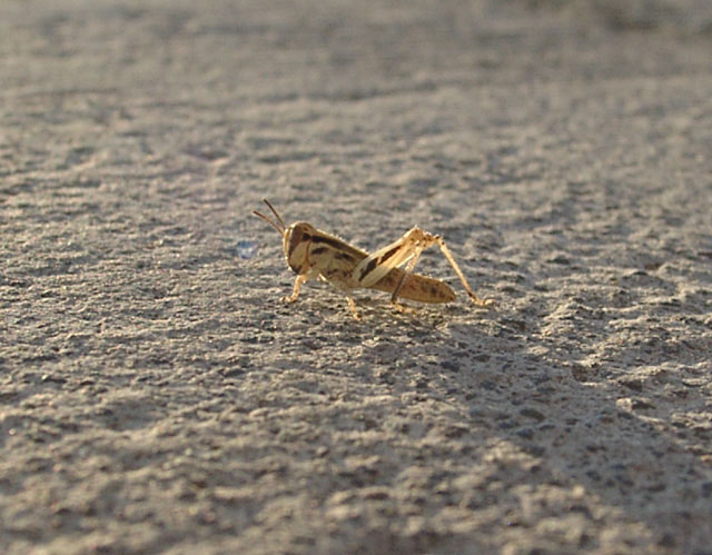
| Good capture but could use a little better focus. Interesting perspective in a challenge full of simular shots. If able, try cropping closer to make your subject appear closer (that is, without losing resolution). |
|
 Photographer found comment helpful. Photographer found comment helpful. |
|
|
07/06/2005 12:35:09 PM |
| seems a bit static and isolated. the centered composition doesn't work for me here and the hopper seems a bit out of focus. the back lighting has potential ...I think that you have a near-miss on this one. |
|
| Photographer found comment helpful. |
|
|
07/05/2005 11:15:23 AM |
| Not as close-up as I would have expected or have seen in this challenge. |
|
|
|
07/05/2005 02:11:21 AM |
| Good detail and clarity on the grasshopper. I think that grass or some other texture might have made a more interesting background for this little critter, making him stand out more. I like the angle of this shot quite a bit--gets us down on his level. |
|
| Photographer found comment helpful. |
|
|
07/05/2005 01:36:00 AM |
| 5 - Nice concept. Just needs focus. |
|
|
|
07/05/2005 01:11:29 AM |
The images that always suffer from a lack of comments are the ones that are right in the middle ground. Everyone comments on the awesome shots. Some comment on the bad shots. But the middle ones, very few people say anything. So here I am to explain why I voted a 5:
I know... the challenge said close-ups as well as macros. And maybe this critter truly is tiny. But he is so far away that he doesn't come close to filling the frame and that's what is making it non-interesting in the middle of a macro challenge.
My suggestion, if your camera won't let you get any closer, would be to crop the photo tighter. Remove the top and bottom 3rds and the left and right 4ths and you'll be about right. However, in doing so, you'll need to watch the resolution of the image because sharpness in the subject will become paramount.
One more thing you could try, even without getting closer or making the grasshopper any larger... put him in the bottom right quadrant of the image. Doing so would give him space (to the left and to the top) to jump into. He looks ready to jump, so give him room to go. Dead center is the least interesting place to put him. (and putting him on the far left would just be wrong) :-)
I hope you've had fun with the challenge and hopefully the comments help. |
|
| Photographer found comment helpful. |
|
|
07/04/2005 11:39:52 PM |
| IMHO the focus seems a bit soft and it could use a little more contrast. |
|
Home -
Challenges -
Community -
League -
Photos -
Cameras -
Lenses -
Learn -
Help -
Terms of Use -
Privacy -
Top ^
DPChallenge, and website content and design, Copyright © 2001-2025 Challenging Technologies, LLC.
All digital photo copyrights belong to the photographers and may not be used without permission.
Current Server Time: 03/12/2025 07:58:53 AM EDT.