| Author | Thread |
|
|
08/08/2005 11:40:51 PM |
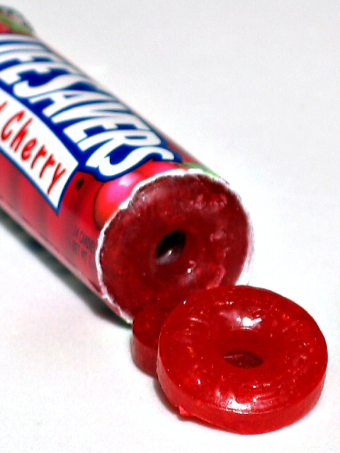
| This is a good idea, but it's kind of blurry. The light is also a tad too bright. |
|
 Photographer found comment helpful. Photographer found comment helpful. |
Comments Made During the Challenge  |
|
|
07/12/2005 01:48:46 PM |
| For some reason, the lighting on this looks too harsh, almost like a direct flash. Try bouncing it off of some white foam board. |
|
| Photographer found comment helpful. |
|
|
07/11/2005 11:11:56 PM |
|
|
|
07/11/2005 01:26:33 PM |
| White seems to have shadow. Fuzzy overall. |
|
| Photographer found comment helpful. |
|
|
07/11/2005 11:03:34 AM |
Subject Impact: Low
Meets Challenge: High
Technical: Low
Composition: Average
Creativity: Low
Score: 4 |
|
| Photographer found comment helpful. |
|
|
07/11/2005 12:09:44 AM |
| seems oversaturated (white areas show artifacts). composition ok. |
|
| Photographer found comment helpful. |
|
|
07/09/2005 01:01:51 PM |
| I would like this better if everything was sharp. It could really help. |
|
| Photographer found comment helpful. |
|
|
07/08/2005 11:50:34 PM |
|
| Photographer found comment helpful. |
|
|
07/07/2005 04:42:18 AM |
| Interesting composition, but just too blurry. |
|
| Photographer found comment helpful. |
|
|
07/06/2005 06:36:17 PM |
| The focus is just a little bit soft. Your colors are vibrant though. This is a shot you might want to try again but using a tripod. |
|
| Photographer found comment helpful. |
|
|
07/06/2005 02:24:54 AM |
| i like the sharpness.. makes the sweets look tasty.. wld be nicer if e sweets were laid out more naturally |
|
| Photographer found comment helpful. |
|
|
07/06/2005 02:14:27 AM |
| I know that it's hard to do on the shot - but I think the shot would work better if the entire package was in focus. The focal point (for me atleast) is the lifesavers lettering.. I think because it's the starkest contrast in the shot, but the focal point is slightly deeper than the focus. |
|
| Photographer found comment helpful. |
Home -
Challenges -
Community -
League -
Photos -
Cameras -
Lenses -
Learn -
Help -
Terms of Use -
Privacy -
Top ^
DPChallenge, and website content and design, Copyright © 2001-2025 Challenging Technologies, LLC.
All digital photo copyrights belong to the photographers and may not be used without permission.
Current Server Time: 03/12/2025 05:14:00 PM EDT.