| Author | Thread |
|
|
05/09/2003 07:46:37 AM |
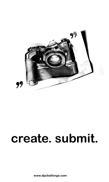
I cut the camera out of an old magazine ad and crumpled it a bit, then shot it against a white backdrop. I bumped up the brightness and contrast in Photoshop to get the white I wanted, and to burn out the top/left edges.
But I think this would've worked much better with a crumpled image of a yellow flower against a blue sky for example. Something a bit more lively than the camera ad.
Thanks for the comments people :) |
|
|
|
05/08/2003 07:32:51 PM |
| yes. you definetely got ripped off. This is by far the best one (other than the original logo of course, which is why i didn't bother submitting). Great job. |
|
|
|
05/08/2003 11:52:44 AM |
| Já ég er sammála muckpond,Myndin er flott!! |
|
|
|
05/08/2003 09:33:33 AM |
You got ripped off -- this was easily the best in the bunch.
Did you do the crumple effect with Photoshop, or was this really a photo that was wadded up? |
|
Comments Made During the Challenge  |
|
|
05/07/2003 01:33:49 AM |
| great ad. simple, not busy and to the point...2nd best design |
|
 Photographer found comment helpful. Photographer found comment helpful. |
|
|
05/07/2003 12:24:57 AM |
| I really like the \"create. submit\" tag line. Simple composition would work well on a sticker. I don\'t quite get the image. Maybe try another photo to enhance the other aspects of a very good entry. Still an 8. |
|
| Photographer found comment helpful. |
|
|
05/06/2003 11:35:40 PM |
| Simple, creative, and it says it all. I love it. |
|
| Photographer found comment helpful. |
|
|
05/06/2003 10:05:27 AM |
|
| Photographer found comment helpful. |
|
|
05/06/2003 08:28:37 AM |
| good for a poster maybe too small for a sticker. No corporate image |
|
| Photographer found comment helpful. |
|
|
05/05/2003 03:59:25 PM |
| nice and simple... elegant |
|
| Photographer found comment helpful. |
|
|
05/04/2003 10:06:48 PM |
| I like the "create. submit." tagline a lot. Nice clean design |
|
| Photographer found comment helpful. |
|
|
05/03/2003 11:50:03 PM |
| this would be a great ad -- the dp big wigs should seriously use this for a print ad.. |
|
| Photographer found comment helpful. |
|
|
05/02/2003 08:11:23 PM |
| I love the style of this one. It is simple, stark, but also attention getting. I'm not sure if it gives enough information (something about digital photography or a contest might have helped) to draw in a good potential user, but I love the general appeal of this. 9 |
|
| Photographer found comment helpful. |
|
|
05/02/2003 01:47:04 PM |
|
|
|
05/02/2003 11:55:16 AM |
|
| Photographer found comment helpful. |
|
|
05/02/2003 10:54:59 AM |
| excellent. a true standout among a mediocre (at best) bunch. |
|
| Photographer found comment helpful. |
|
|
05/01/2003 06:09:39 PM |
| Very nice, creative approach. Not sure it necessarily gets the message across to "outsiders" but I really like the simplicity of your design. --8 |
|
| Photographer found comment helpful. |
|
|
05/01/2003 06:06:54 PM |
| I really like the basic design of this sticker. The crumpled camera photo is great. I'm a little unsure about the quotations and choice of font but I think the simplicity and layout are great. |
|
| Photographer found comment helpful. |
|
|
05/01/2003 04:41:15 PM |
| please win, this is the best.... crosses fingers... |
|
|
|
05/01/2003 01:48:00 PM |
| I thought the rules said that it should be the other direction ("5 inches wide by 3 inches tall "), but I like this layout. Effective and simple. The web addy is too small though. |
|
| Photographer found comment helpful. |
|
|
05/01/2003 12:29:11 PM |
| This is a really cool looking ad, but for a sticker, the url isn't big enough. The URL is also off-center. Still one of my highest rated designs. |
|
| Photographer found comment helpful. |
|
|
05/01/2003 11:48:40 AM |
|
|
|
05/01/2003 11:45:35 AM |
| Professional. Striking. Enigmatic enough to make me want to visit the URL to find out more. My single 10 in this challenge. |
|
| Photographer found comment helpful. |
|
|
05/01/2003 11:02:19 AM |
| fantastic. Clean, simple. great. I'd love it more if the quotes were rotated properly to frame the camera |
|
| Photographer found comment helpful. |
|
|
05/01/2003 11:02:06 AM |
|
|
|
05/01/2003 10:55:25 AM |
| Reminds me of the cameras I turned in when I retired. |
|
|
|
05/01/2003 12:11:24 AM |
|
|
|
05/01/2003 12:07:38 AM |
| I like the use of white space here. Adds interest and drama. |
|
| Photographer found comment helpful. |
Home -
Challenges -
Community -
League -
Photos -
Cameras -
Lenses -
Learn -
Help -
Terms of Use -
Privacy -
Top ^
DPChallenge, and website content and design, Copyright © 2001-2025 Challenging Technologies, LLC.
All digital photo copyrights belong to the photographers and may not be used without permission.
Current Server Time: 03/12/2025 02:30:00 AM EDT.