| Author | Thread |
|
|
05/18/2003 10:27:07 AM |
From the Critique Club
WOW!!! I got the WINNER!!! I am sooo impressed :)
This going to be a very short critique, as your postcard is just right, I wouldn't add or take away anything, it's fine the way it is. I read the comments below, to see if I could pick up something to say besides, "Great postcard!", but, no luck.
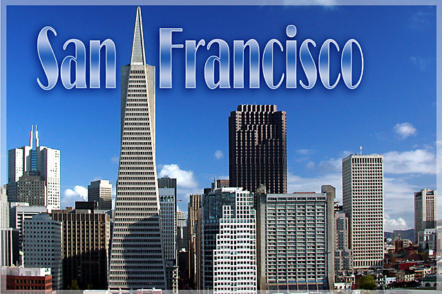
I love the colour of the sky, the clouds close to the horizon line, the angularity of the buildings - it's a dynamic shot. The shadows on the buildings make it more human. This postcard tells me that I wouldn't want to go to San Francisco to spend a relaxing time by the lake, but I'd go there to DO something, something fun and interesting.
OK, before I type up a bunch more superlatives, I'll quit. Keep up the good work!
Ursula |
|
 Photographer found comment helpful. Photographer found comment helpful. |
|
|
05/16/2003 01:25:02 PM |
| Congratulations on first place, well deserved! |
|
| Photographer found comment helpful. |
|
|
05/13/2003 06:53:05 AM |
Well done Pep from down under. Love the blue and it give me food for thought, I wish I could see some the opportunities you guys do.
Regards Paul H |
|
| Photographer found comment helpful. |
|
|
05/12/2003 11:59:19 PM |
| Excellently done! It really does look like a professionally produced card... from the beautiful photo to the well-managed text. Congrats! |
|
| Photographer found comment helpful. |
|
|
05/12/2003 06:38:04 PM |
| Excellent postcard. Love the lines and shapes. The Text fits very well. Congrats!!! |
|
| Photographer found comment helpful. |
|
|
05/12/2003 04:20:12 AM |
| beautiful work, Pep! congratulations on a well deserved blue ribbon! |
|
| Photographer found comment helpful. |
|
|
05/12/2003 02:18:23 AM |
| congrats from another who was born, but not entirely raised in this wonderful city! :) wonderful and striking shot--classic postcard! |
|
| Photographer found comment helpful. |
|
|
05/12/2003 01:55:40 AM |
| Superb work - congrats on your THIRD ribbon! |
|
| Photographer found comment helpful. |
|
|
05/12/2003 01:53:53 AM |
| Congratulations from one who was raised in this lovely city. Good job! You were fortunate to catch this glorious city on a day without fog. |
|
| Photographer found comment helpful. |
|
|
05/12/2003 01:43:56 AM |
| This is an excellent postcard. However, I believe that the border is illegal. How did you do it? |
|
| Photographer found comment helpful. |
|
|
05/12/2003 12:21:50 AM |
|
| Photographer found comment helpful. |
|
|
05/12/2003 12:13:14 AM |
Nice photo..good choice of fonts,effects applied and proper placement..
Congrats!! |
|
| Photographer found comment helpful. |
|
|
05/12/2003 12:10:23 AM |
| Thank you all for your great comments and votes. This shot was taken from the roof where I live. Made some adjustments in PS (levels, contrast, saturation, unsharp mask) and added a text using the Broadway type. |
|
|
|
05/12/2003 12:05:49 AM |
|
| Photographer found comment helpful. |
|
|
05/12/2003 12:04:04 AM |
| Great shot and well deserving. Congrats on another ribbon! |
|
| Photographer found comment helpful. |
Comments Made During the Challenge  |
|
|
05/11/2003 08:50:27 PM |
| Cleaver composition. I like the tall building cutting the shot in thirds!! |
|
| Photographer found comment helpful. |
|
|
05/11/2003 03:45:55 PM |
| This looks so professional. Great shot and an excellent job with the text. How did I ever give this a 9? Bumping into my 10's : ) |
|
| Photographer found comment helpful. |
|
|
05/11/2003 10:50:53 AM |
| "Bless it's pointy little head." Type and border give the whole thing the look/feel of an illustration; works well with this image. |
|
| Photographer found comment helpful. |
|
|
05/11/2003 06:18:45 AM |
| I really enjoyed your submission, it should place well in this week's competition. 8 Morgan |
|
| Photographer found comment helpful. |
|
|
05/09/2003 03:25:59 PM |
|
| Photographer found comment helpful. |
|
|
05/08/2003 10:36:20 PM |
| Now this looks like a postcard! Very nice. No nitpicks ... |
|
| Photographer found comment helpful. |
|
|
05/08/2003 10:04:14 PM |
| Stunning, perfect postcard shot. 10 |
|
| Photographer found comment helpful. |
|
|
05/08/2003 12:38:31 AM |
| The use of text here clearly enhances, rather than detracts from this shot. The border does well to stay out of the way of a clear, bright and superb shot. Excellent work. I wouldn't change anything - 10. |
|
| Photographer found comment helpful. |
|
|
05/07/2003 08:46:12 PM |
| Oh, you have done such a fine job with your photograph...as a long time resident, NEVER call it Frisco. Looks like a brilliant Spring day - with a long lens. |
|
| Photographer found comment helpful. |
|
|
05/07/2003 03:17:51 PM |
| Excellent job! Wonderful sky, good skyline, good font, well exposed, good dof. |
|
| Photographer found comment helpful. |
|
|
05/07/2003 12:27:10 PM |
| I like the picture, but the text is overpowering. |
|
| Photographer found comment helpful. |
|
|
05/07/2003 11:32:05 AM |
| This loks like a post card that I would pay for send to someone if I were to visit. Outstanding job! Perfect choice of text placement and font style. |
|
| Photographer found comment helpful. |
|
|
05/06/2003 08:09:28 PM |
| Love the geometry of this shot. It's all about triangles and squres in my eyes, not just buildings. Loeve the text. Really goes well with the image. Jacko. 9 |
|
| Photographer found comment helpful. |
|
|
05/06/2003 04:49:15 PM |
| Truly a postcard photo. Great font use and the boarder sets it off great. 10 |
|
| Photographer found comment helpful. |
|
|
05/06/2003 12:08:27 PM |
| Wow! That blue sky really pops out! Cool! |
|
| Photographer found comment helpful. |
|
|
05/06/2003 09:27:24 AM |
now that's a postcard :) Really beautiful work.
|
|
| Photographer found comment helpful. |
|
|
05/06/2003 05:56:05 AM |
| I really like how you placed the tall building and I like the transparent border. The text works well also. The only bad thing I can see is the lower shadows on the buildings to the left, but that is nitpicking. GREAT postcard!!! |
|
| Photographer found comment helpful. |
|
|
05/06/2003 02:26:02 AM |
| Excellent shot and your font looks very professional. 9 |
|
| Photographer found comment helpful. |
|
|
05/05/2003 07:46:45 PM |
| This looks exactly like a post card. It is good and clear. Well done. |
|
| Photographer found comment helpful. |
|
|
05/05/2003 07:32:31 PM |
| Excellent shot and font. Where did you take the shot from? This one will win most likely because it's such a typical looking postcard. Absolultely excellent, I'm jealous. 10. |
|
| Photographer found comment helpful. |
|
|
05/05/2003 05:36:19 PM |
This looks the most like a postcard to me. Very nice job. 10
|
|
| Photographer found comment helpful. |
|
|
05/05/2003 04:00:48 PM |
| Now THAT looks like a postcard! Great job all around! The font and placement of the text is just super. |
|
| Photographer found comment helpful. |
|
|
05/05/2003 11:11:53 AM |
| Perfect time of day for this shot. The shadows accent the buildings and the blue sky with the white clouds make a nice accent to the skyline. 10 -danny |
|
| Photographer found comment helpful. |
|
|
05/05/2003 10:29:02 AM |
| Nice shooting. Professional looking job. |
|
| Photographer found comment helpful. |
|
|
05/05/2003 09:32:58 AM |
| Great font, love the blue skies, and the vantage point you chose is awesome; great shapes! |
|
| Photographer found comment helpful. |
|
|
05/05/2003 07:00:56 AM |
| Beautiful! Excellent work, what more can I say? 10 - Kiwi. |
|
| Photographer found comment helpful. |
|
|
05/05/2003 02:33:02 AM |
| My old hometown. I left it because of the overcrowding, but there is still a warm spot for all the familiar places... |
|
| Photographer found comment helpful. |
|
|
05/05/2003 01:17:41 AM |
| looks like a postcard to me! nice and crisp, easily read.. cool |
|
| Photographer found comment helpful. |
|
|
05/05/2003 01:04:11 AM |
| Definately a great post card. I love the lay out. Nice use of the text. Very fitting. |
|
| Photographer found comment helpful. |
|
|
05/05/2003 12:47:40 AM |
| WOW what a fantastic photo, I thought I had already seen some great postcards but this one is incredible. Very well done. Well worth a 10. |
|
| Photographer found comment helpful. |
|
|
05/05/2003 12:39:22 AM |
| On a cloudier day I'd say that text would be very fitting, however with a nearly perfect blue sky that text seems very out of place in this picture. A gradient with more blue in it might have looked better... The image itself looks great. The only bad thing about it si the sahdows on some of the buildings, a different time of day might have corrected this. Overall I'd have to say well done. it loooks good. |
|
| Photographer found comment helpful. |
Home -
Challenges -
Community -
League -
Photos -
Cameras -
Lenses -
Learn -
Help -
Terms of Use -
Privacy -
Top ^
DPChallenge, and website content and design, Copyright © 2001-2025 Challenging Technologies, LLC.
All digital photo copyrights belong to the photographers and may not be used without permission.
Current Server Time: 03/12/2025 07:47:30 AM EDT.


 Hi there! Greetings from Frisco!!


