| Author | Thread |
Comments Made During the Challenge  |
|
|
05/13/2003 03:02:09 PM |
|
|
|
05/13/2003 01:04:37 PM |
| try to reduce the jpeg compression, it makes the image look blocky |
|
|
|
05/13/2003 12:10:30 PM |
| this is an interesting image, i think it was oversharpened in photoshop and thats why it seems grainy. 4 |
|
|
|
05/12/2003 11:43:42 PM |
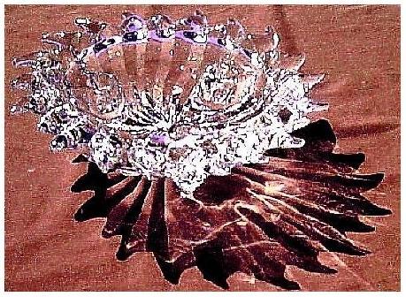
| A softer more ambiant light should have been used to show the detail of the bowl without so much flare. If the shaddow and light refraction is the main subject.... perhaps the bowl could have been almost removed from the shot? (ie: shoot over it making sure it had no focus?) |
|
|
|
05/11/2003 04:48:46 PM |
| very neat effect, I think I would have preferred if the little tile pattern was bigger. :) |
|
 Photographer found comment helpful. Photographer found comment helpful. |
|
|
05/11/2003 04:28:53 PM |
| The shadow of this is stunning. I wish it were a little cleaner image, but maybe that's what you were aiming for! |
|
| Photographer found comment helpful. |
|
|
05/10/2003 07:55:39 PM |
| Very nice idea, however I think you do need to have put your glass in better focus. I am also not sure about the background you have used (unless that is what has given the glass the purple fringing, but I doubt it. You probaly could have got a much better effect on a different background. |
|
| Photographer found comment helpful. |
|
|
05/09/2003 05:20:13 PM |
| Seriously bad, no offense. |
|
|
|
05/09/2003 04:04:58 PM |
| The highlights seem over exposed (blown out). I like the setup though. Good job. |
|
| Photographer found comment helpful. |
|
|
05/09/2003 10:59:01 AM |
| Too sharp & jagged. Blown out areas are distracting. I like the shadow though. |
|
| Photographer found comment helpful. |
|
|
05/09/2003 01:38:42 AM |
| Great concept, nice design. I love the shadow, but wish the highlights were more distinct, less 'burned out'. The image seems to move, but dang that exposure! |
|
| Photographer found comment helpful. |
|
|
05/09/2003 12:16:57 AM |
| too much JPEG artifacts on this one, and I have to comment that the contrast is too high. |
|
| Photographer found comment helpful. |
|
|
05/08/2003 04:02:30 PM |
| Great idea. Unfortunately the abstract bit detracts from the galss bit (in my ever so humble opinion) and the galss bit is a tad over exposed mid right. Still I really like the image |
|
| Photographer found comment helpful. |
|
|
05/08/2003 12:24:52 PM |
| The glass itself is pretty detailed and busy, so I find that I'm distracted by the equally busy shadow. |
|
| Photographer found comment helpful. |
|
|
05/07/2003 11:28:46 AM |
| If it weren't so pixelated/cracked, I could grade this a 9 or 10 with a clean conscience. |
|
| Photographer found comment helpful. |
|
|
05/07/2003 11:05:57 AM |
| I really like your use of the shadow in the composition, as well as the sparkles of light on the glass itself. I tend to find the high contrast a bit distracting, however. While it brings out the highlights, you are losing a lot of detail that might add interest to the shot. Creative, though, and quite pretty. |
|
| Photographer found comment helpful. |
|
|
05/07/2003 01:24:48 AM |
|
| Photographer found comment helpful. |
Home -
Challenges -
Community -
League -
Photos -
Cameras -
Lenses -
Learn -
Help -
Terms of Use -
Privacy -
Top ^
DPChallenge, and website content and design, Copyright © 2001-2025 Challenging Technologies, LLC.
All digital photo copyrights belong to the photographers and may not be used without permission.
Current Server Time: 03/12/2025 02:25:53 PM EDT.