| Author | Thread |
|
|
08/11/2005 07:06:01 PM |
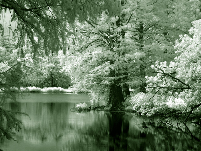
| I really like this image but I agree the green is a bit much. I would think a grey blue might work well or maybe a blue green. It would be fun to see a green for the shadows and blue with highlights or vice versa! |
|
 Photographer found comment helpful. Photographer found comment helpful. |
|
|
08/10/2005 01:49:09 PM |
| Green = serene. Yes, that works. I also think this works especially well because it is reversed. We expect the trees to be green but they are white. the infared emphasizes the difference in texture between the leafy foliage and the smooth surface of the water. Interesting that the reflections of the light leaves are actually dark. |
|
| Photographer found comment helpful. |
|
|
08/05/2005 02:41:21 PM |
| I think the choice do duotone an IR shot is great - but I think the green might be a tad too extreme for my taste here. Even though we're doing duotone, I think I'd prefer to see the whites remain relatively white (and same with the blacks) rather than all turn to a greenish tint. |
|
| Photographer found comment helpful. |
|
|
08/04/2005 10:11:05 AM |
| I find it to be a great edit. I love infrareds to begin with. I suppose I think the green is a bit "minty" looking to me but that is just a personal choice. Nice composition as well. |
|
| Photographer found comment helpful. |
Home -
Challenges -
Community -
League -
Photos -
Cameras -
Lenses -
Learn -
Help -
Terms of Use -
Privacy -
Top ^
DPChallenge, and website content and design, Copyright © 2001-2025 Challenging Technologies, LLC.
All digital photo copyrights belong to the photographers and may not be used without permission.
Current Server Time: 03/13/2025 03:59:05 AM EDT.