| Author | Thread |
|
|
08/20/2005 08:03:19 PM |
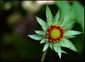
congrats on your highest place finish yet!!! Good job!!! This is a great photo if I was around when we were voting I would have given it an 8+.
Chat with ya soon - I am now back from Belize. |
|
 Photographer found comment helpful. Photographer found comment helpful. |
Comments Made During the Challenge  |
|
|
07/24/2005 01:52:44 AM |
|
| Photographer found comment helpful. |
|
|
07/22/2005 08:21:04 PM |
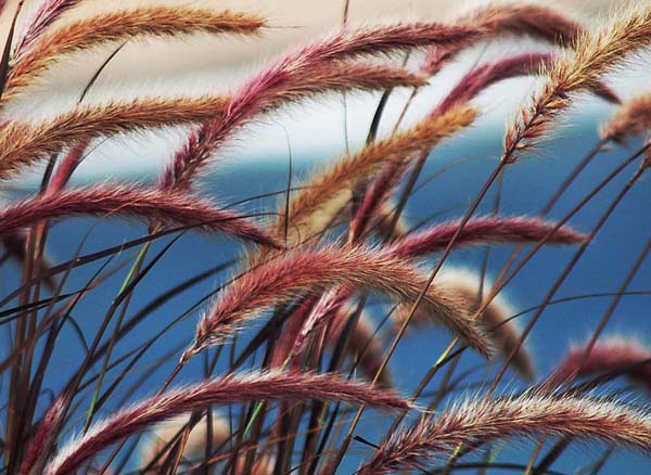
Meets the challenge well. Good flow, great colours and a background that works very well here. DOF is good, it's often problematic in scenes such as this.
Good luck in the challenge. -9 |
|
| Photographer found comment helpful. |
|
|
07/22/2005 06:34:09 AM |
|
| Photographer found comment helpful. |
|
|
07/21/2005 11:55:17 PM |
| I like the colors and composition here a LOT!! Good job. |
|
| Photographer found comment helpful. |
|
|
07/21/2005 11:37:53 PM |
| Good shot! Like the DOF; like the different colors; good background color. very nice! |
|
| Photographer found comment helpful. |
|
|
07/21/2005 01:12:06 PM |
| Nice color and the background is such a compliment to the fuzzies. |
|
| Photographer found comment helpful. |
|
|
07/21/2005 10:57:42 AM |
| Absolutely beautiful and good texture! |
|
| Photographer found comment helpful. |
|
|
07/20/2005 04:47:29 PM |
Composition: Feels quite dynamic though maybe a bit too busy. The white band near the top is slightly distracting though does follow the flow of the grass. 6
Exposure: Seems ok though maybe a touch overexposed. Some small areas appear to be a bit too bright. 6
Impact: Has a relaxing feel though I think a little less grass and maybe a sense of movement would would increase the appeal. 6
Overall: 6
|
|
| Photographer found comment helpful. |
|
|
07/20/2005 06:57:44 AM |
| The change in the background - blue to white distracts from the image. Otherwise very good. I like the idaa. |
|
| Photographer found comment helpful. |
|
|
07/20/2005 01:56:17 AM |
| How pretty. I really like your picture. |
|
| Photographer found comment helpful. |
|
|
07/20/2005 12:20:54 AM |
| I really like this. I like the slightly soft look and hope you don't get voted down because of it (DPC voters do seem to like ultra sharp). I think a touch more DOF to bring all the strands into focus would be better. |
|
| Photographer found comment helpful. |
Home -
Challenges -
Community -
League -
Photos -
Cameras -
Lenses -
Learn -
Help -
Terms of Use -
Privacy -
Top ^
DPChallenge, and website content and design, Copyright © 2001-2025 Challenging Technologies, LLC.
All digital photo copyrights belong to the photographers and may not be used without permission.
Current Server Time: 04/02/2025 06:43:27 AM EDT.