| Author | Thread |
Comments Made During the Challenge  |
|
|
07/26/2005 02:21:08 AM |
| Scary. Wish the building wasn't in the background. Good eye. Great colors. Textures easily visible. |
|
 Photographer found comment helpful. Photographer found comment helpful. |
|
|
07/25/2005 08:42:28 PM |
| Strong emotional content gave me a strong emotional response. Kudos!!! I can see this taking "best in show"..... |
|
| Photographer found comment helpful. |
|
|
07/24/2005 01:20:49 AM |
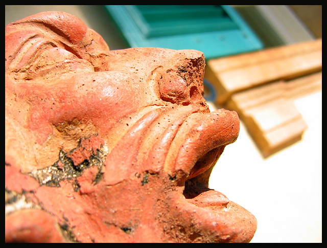
| Woah, that's some serious stress going on on that statue... Strong textures on it, good blend in background, fantastic emotion, phenominal complete picture |
|
| Photographer found comment helpful. |
|
|
07/22/2005 11:53:00 PM |
| Incredible subject! IMHO, the background is a bit distracting and the lighting seems a bit harsh, but you hit the texture theme on the head. |
|
| Photographer found comment helpful. |
|
|
07/22/2005 05:00:24 PM |
| I had the opportunity to see this photo before it was submitted in the challenge, if there has never been a photo properly titled, there is one now. Unfortunately this entry was not the way I saw it. The photo I saw would finish this challenge in the top three. Composition is impactful! |
|
| Photographer found comment helpful. |
|
|
07/22/2005 02:58:34 PM |
| Good texture in the face. I find the "stuff" in the background a bit distracting. Maybe a more solid background? |
|
| Photographer found comment helpful. |
|
|
07/21/2005 09:55:26 PM |
| Background distracting/orverexposed |
|
| Photographer found comment helpful. |
|
|
07/21/2005 11:58:52 AM |
| Seems a little too bright overall. But the light shows the textures on the subject very well. |
|
| Photographer found comment helpful. |
|
|
07/20/2005 07:45:12 PM |
| woa...creepy! It may have been more effective if the background was solid |
|
| Photographer found comment helpful. |
|
|
07/20/2005 10:33:33 AM |
| This would've been better with a different background. It's also too bright. |
|
| Photographer found comment helpful. |
|
|
07/20/2005 10:15:45 AM |
| I really think if you subtracted, the very distracting background you have a very high placing entry. I am sure you have already got comments like that. So I would like to tell you what else MAY help. The subject is looking up, and to the right, and you have all this extra space, but none in the direction of the eyes. I think maybe the right side should be cropped off a little and the space to the top should have a little bit more. The Hue/Saturation may of been a cool option too, or maybe even complete desaturation turning it B&W. The light could of also been enhanced to show more shadow, giving much more depth. I am not trying to be over critical here, not in the least, I just really like the picture, and think you could of got into the top ten with a couple of minor adjustments. Still even with that said I voted you into the better half of the submissions. |
|
| Photographer found comment helpful. |
|
|
07/20/2005 12:25:37 AM |
| Lighting is harsh and too even to bring out the true texture on this. |
|
| Photographer found comment helpful. |
Home -
Challenges -
Community -
League -
Photos -
Cameras -
Lenses -
Learn -
Help -
Terms of Use -
Privacy -
Top ^
DPChallenge, and website content and design, Copyright © 2001-2025 Challenging Technologies, LLC.
All digital photo copyrights belong to the photographers and may not be used without permission.
Current Server Time: 04/28/2025 09:18:17 AM EDT.